Friday, 11 January 2013

Birmingham Library

This article was posted originally one week ago, but after re-reading it I realised that it was just a rant, with little academic or constructive content.  As a result, I've updated it and added a conclusion to redress the balance.  Enjoy!


While visiting Birmingham Art Gallery I had the misfortune to walk past a new building: the new "Library of Birmingham".  This new building is truly the ugliest construction I have ever seen in my entire life.  Don't get me wrong -- I'm no prude when it comes to architecture.  I may not like the work of Frank Lloyd Wright and Gaudi but I respect it.

However, this new building is in a class of its own when it comes to horribleness!


Old Library


To put thing into context, let's take a look at the old Central Library, designed in 1974 by John Madin (who also designed BBC Pebble Mill, now demolished).  Its Brutalist style led Prince Charles to state, famously, that it looks like "more like a place for burning books, than keeping them."


OK, so it's a bit scary.  But by the 1990s the council had prettified it slightly, making it a bit more warm and friendly.
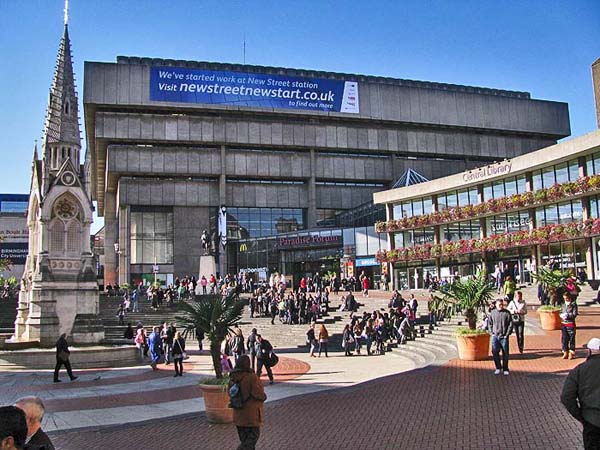

Inside, it's a mess of escalators & rectangular spaces but at least it feels like a place of learning; the fountain and arena outside are amazing in the summer.


New Library


Now for the horror.  If you have a sensitive stomach you may wish to turn away now.


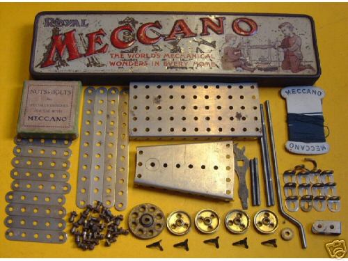
That's it -- the gold thing to the right.  My photo tames it slightly, but the image below gives a little clearer idea of just how jaw-droppingly gruesome the ironwork circles look close-up.  (The architects are called Mecanoo, which is so close to Meccano that the whole thing sounds like a practical joke.  Sadly not.)


Aside from being out-of-tone with all other buildings nearby, this Flickr photo demonstrates how the in-yer-face gold decoration would look far more suited to a multi-storey car park in the Middle East than a creative hub in a bustling, modern city.
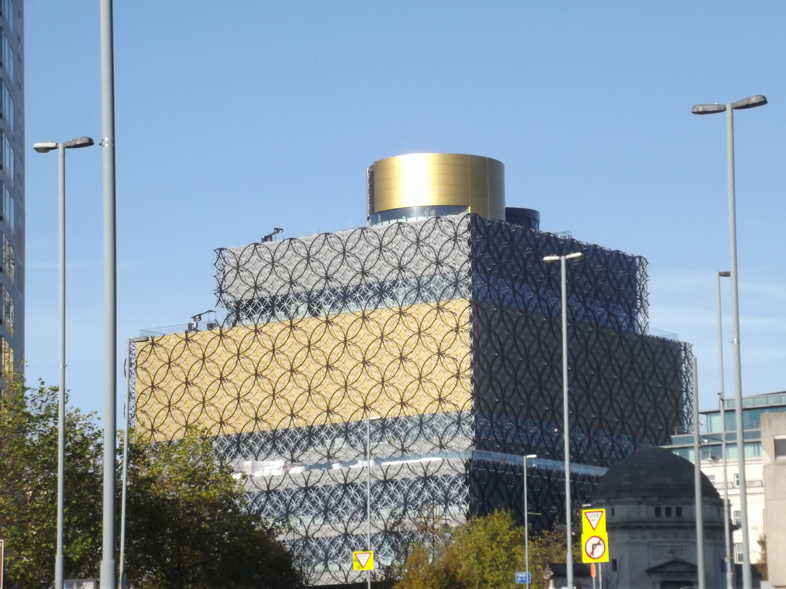

So there you have it.  The new Birmingham Library.  The old one will be demolished, and this vile monstrosity will take over as the new place to burn books.

You may not agree with my opinions on this, but I just had to say something!  Thank you for listening.


Conclusion


So what have I learned from this experience?  Firstly, that art can be very different first-hand -- the photos above subdue the effect somewhat.  Secondly, that even something as mundane as a rectangular building has the power to shock.

Attempting to get a more objective view as a designer, I did a bit more research online to find people's views on the new building.  Of course, this is likely to be biased toward those who feel the wish to vent their spleen, but it is vitally important to be impersonal in order to evaluate the initial impact of the design.

A handful of comments on the Architects Journal website are all negative, with one mentioning potential pigeon problems (something I'd noted myself) and another asking how the underlying glass windows will be cleaned.  The nature and location of the posts suggest that these are from people with good knowledge of architecture.

General public comments on SkyscraperCity XL (100 pages plus of discussion!) are mixed, and feedback on the Facebook page also contains both positive & negative views.

Looking around, a fair few people have questioned the need for a new library at all, given the general cuts in library services nationally and the cultural shift to electronic media.  This is a good example of where public opinion is based on a misconception, because further research reveals that the library is predominantly an archive for books; the old library had temperature control problems, so the stock had to be shifted to a new, stable, environment otherwise it would rot away.

The new library has clearly polarised opinion, and it will be difficult to find any consensus with which to judge things objectively.  Therefore, this needs to be evaluated from a perspective of greater insight into architecture & contextual architectural trends, and I simply don't have the background knowledge to do that.


So, in conclusion, I've been reminded of the need to stay objective as a designer; to avoid letting my own personal opinions cloud my professional judgement.

Thursday, 10 January 2013

Breakthrough in Birmingham!

Breakthrough!


During the Xmas break I'd been trying to work out where to go next with my MA research work.  After quickly hitting a number of dead ends, I'd started to despair that I would ever find a next step.

And then ... Bam!  Eureka!  The Government Art Collection came to my rescue with, of all things, a pianola...


Government Art Collection


This exhibition, at Birmingham Art Gallery, covers 200 works of art over a very wide range of periods.  To describe it as eclectic would be an understatement.


At the centre of the exhibition is a colour-themed room entitled Richard of York Gave Battle in Vain, featuring works arranged in colour groups by Cornelia Parker.  At the doorway hangs a Peter Blake screenprint of the Beatles.


Nearby, contrasting well with the sour-faced Lady Anne Motagu, stands a stunning portrait of Lady Ada Byron (a.k.a. Ada Lovelace) by Margaret Carpenter, which used to hang at No. 10, Downing Street.  The image encapsulates both intelligence and beauty, and reflects Lady Ada's prominence and importance as the world's first computer programmer.


Pianola!


Pretty much all the exhibits were paintings, photographs or small sculptures ... except one.  This one was noisy and wonderful!

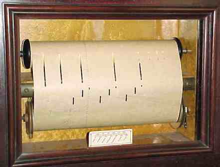
4'33" (Prepared Pianola for Roger Bannister) by Mel Brimfield was commissioned for this collection and certainly grabs attention.


It started with a crash of cymbals & bang of drums, and proceeded to draw a crowd in the small Gas Hall gallery.  What was really interesting was the reaction of the kids ... kids who have grown up watching Thor and The Hulk duke it out with aliens, and mobile phones that let you wander virtually down a street in another country ... absolutely bewitched by a piano that plays itself.


This represented a perfect combination of nostalgia for parents (who, in most cases, would never have seen a pianola in the flesh but would be familiar with the concept from films & TV) and fascination for children.

The music roll, with its perforated holes, represents the list of instructions for this programmable 19th Century music machine, with a heritage going back to the Jacquard Loom -- striking in its (unintended?) juxtaposition with the portrait of Ada Lovelace in the same gallery.


For a generation of kids who are used to singing & dance video games, like Rock Band and SingStar, this format of moving lines & dots of instructions is totally familiar.


Is there a way to combine these?  Can it be manipulated to form a nostalgia-tickling game that will appeal to a range of ages?  And capture the magical affect experienced by those kids & adults in the gallery?

Following the enormous success of Minecraft, game developer Mojang have been working on 0x10c, a game based around computer programming.  Devices like the Raspberry Pi may not have achieved their aims, but they've certainly got people talking about computer programming.  There is a definite zeitgeist here.


A pianola-themed game will form the crux of my work over coming weeks as I seek to develop game mechanics which can exploit the notion of fun, interactive, programmable (music?) machines in a methodical and meaningful way.

Saturday, 29 December 2012

Will Self & Showaddywaddy

In the recent radio programme A Point of View: Digital Past (helpfully transcribed on the BBC website), Will Self talked about his views on how digital technology affects nostalgia.

At the ripe old age of 51 he suggests that "the young are so very nostalgic", comparing the nostalgia of an older generation as "hoarding" the past.  This is a modern reversal of the traditional view that old age is synonymous with "obsessive dwelling on happier former days".
I must admit to being bemused at this notion, which Self states without proof or argument.  To me, as someone who works with 16-21 year-olds, surrounded by a range of ages in the staff room, it seems that this phenomenon still inexorably peaks at middle age.  (Note to self: must do some research into that.)
He postulates that the 20th Century has made it easier, progressively, to create concrete evidence of experiences, citing a number of examples -- which I've categorised as personal (via traditional photos, cine/video cameras, digital cameras or mobile phones), communal (Friends Reunited, Facebook) or societal (e.g. television archives, YouTube & Google Images).

"The hard drive of my computer", says Self, "is overloaded with digital images of the places I've been and the people I've met, all of them time-coded to a 10th of a second."  As a professional broadcaster, he also has audio files of conversations dating back 16 years.  He can quickly identify the exact date and time of events, and cross-reference them with public events.

For the last 30 years I've had very fond memories of my 14th birthday, when I was taken to see my favourite band (at the time, I should add! -- I got far cooler in my teens): Showaddywaddy, at the Fairfield Halls in Croydon.  I remember it vividly because it was one of the happiest moment of my childhood.  I also recall that my birthday fell on a Sunday that year, because it coincided with Mothers' Day.


Only it wasn't my 14th birthday.

While meandering around the web I came across the official Showaddywaddy website.  To my surprise they had a detailed list of every gig they had ever played, going all the way back to 1973!  According to that, the gig I attended took place in 1980, when I was 11 years old.

This suddenly made sense.  By 14 I'd gone mad for synthesizer genius Howard Jones, so I wouldn't have been seen dead near the un-coolness of a '70s band famous for 1950s cover songs.  So why did I think I was 14 at the time?  Who knows?

What's more interesting is that Internet technology has allowed me to accurately place the date of an event which took place 32 years ago, correcting my own mis-remembered version.  In addition, last year I downloaded bootleg recordings from a later Howard Jones gig I attended at the Royal Albert Hall in 1985, giving me not only the date & time but also the full set I heard on the night.

Finally, with a name-check to Jean Baudrillard (whose ideas were covered in a recent lecture on postmodernism given by James Battersby at UCLan), Self questions whether the nature of past 'reality' is now determined by corporations like Microsoft and Google.

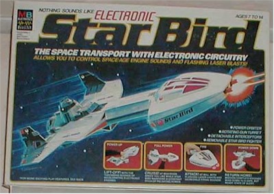
That's an interesting question.  The wonder of Google images lets me quickly locate images of a 1978 un-necked, ring-pull Coke can or even a 1980 MB Games Star Bird (sister product to the recently resurrected Big Trak) but I'm often hampered by the search algorithms, which favour "I think I know what you mean" over precision.


Has this easy access to 'images of the past' affected my nostalgia?  Yes, definitely.

Is Will Self right?  Has digital technology augmented our nostalgia, or is it undermining it?  For better or worse, only time will tell.

Wednesday, 12 December 2012

The right kind of memories

During a recent presentation by contextual studies lecturer (and occasional chemist) James Battersby, we were encouraged to be creative in our layout -- "After all," he said, "you are design students."

So, while writing my recent Literature & Contextual Review, the thought struck me that I should take him at his word and apply appropriate styling to my work: something which would trigger nostalgic memories in any assessor who looked at it.

Firstly, I needed to define my target audience.  Most of the relevant tutors who would be likely to be looking at the work would range in age from 20 through to 50, with a median around 40 years old.  So I picked something which was likely to trigger memories in somebody who grew up in the 1970s, especially someone with more academic leanings, but was likely to have a slightly wider appeal...


The 1978 double LP Jeff Waynes' Musical Version of The War of the Worlds was a big hit back in its day, and sported recognisable artwork which contained iconic images which would stick in peoples' minds -- for example, the tripod on the front cover, or the horror image of a bird tugging at Martian flesh.  It had been re-released enough times to suggest that it would resonate with a fairly wide age range.

I had felt confident that this would unlock memories, but upon seeing the artwork images, I realised that these might cause negative reactions in addition to positive ones, especially out of context.  In addition, it would prove difficult to justify their inclusion, as they are not thematically connected to the academic work being produced.  As a final nail-in-the-coffin, the logo -- which I had hoped might have some stylistic nostalgia -- is not sufficiently recognisable in isolation away from the 'tripod'.

So, I set about looking for a new theme.

While noodling on the 'academic' angle, I looked for associated triggers from primary school.  This led me to Ladybird Books.  As I explored this angle, it became apparent that this format would make an excellent vessel for an academic piece, mainly due to the formal styling and very broad age appeal.  Many tutors would be unlikely to have read a Ladybird book for decades, so the 'deeper' memory would result in a stronger affect.

A trawl of Google images gave a lot of material to sample, but it was Boys and Girls: A Ladybird Book of Childhood which provided a major source of illustrations.  I had hoped to create original images in the Ladybird style, but time was against me -- so I hoped that copyright infringement would not be an issue in an obvious homage.

One thing which came as a surprise was the choice of typeface.  My own memory suggested that the books used a basic TimesHelvetica or Gill Sans.  However, research showed that many Ladybird books actually used Sassoon Primary.  In a quest for authenticity I tried using Sassoon, but found it to be largely unusable for formal text.  In the end I actually plumped for Sasson for headings but Century Schoolbook for main text, because it was more evocative of the textbooks of my youth -- another example of percieved memories winning over factual content.

The final aesthetics for my Literature Review are shown below.  I opted for an authentic-looking cover; with right-side illustrations related to the left-page text; and dropped example photographic illustrations in the right-side image spot in later pages.  I had hoped to present the finished item as a hardcover-bound book but, again, ran short on time.


This themed approach worked well for a document, and I believe that there is potential for a licensed children's game based on this visual styling, perhaps aimed more at a 'grandparent' audience but accessible for 4-7 year-olds.

Sunday, 9 December 2012

Playing the Past

Retro-gaming has become a bit of an annoyance for me recently.

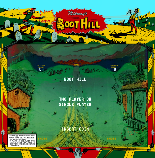
Boot Hill: Even now,
I can hear the funeral march.
Don't get me wrong -- I love old games, and I love references to them: everything from the postmodern madness of Scott Pilgrim right back to Breakout (my first arcade game experience, on holiday in Bracklesham Bay in 1978!)

However, if you go searching for any kind of link between 'nostalgia' and 'video games' (or any associated words) then 99.99% of the results you find are about retro-gaming.

And that presents a bit of a problem, because my research is centred on general nostalgia, and its application within game design.  Yes, most people under 45 will have fond childhood memories where video games will play a strong part.  But that has already been done -- to death -- in retro-gaming, and I'm looking for a different angle.

Imagine my surprise when I came across a book addressing the use of non-game nostalgia within game design.

Imagine my even greater surprise when I found that it had a chapter on applied use of nostalgia in game design, using the Battlestar Galactica game (Vivendi / Warthog, 2003) as an example.

Why?  Because my course tutor Josh Taylor was senior artist on that game!  This appears to be a complete coincidence.  (If not, I've been played like a funky piano).

The book is called "Playing the Past: Hostory & Nostalgia in Video Games" and is edited by Zach Whelan & Laurie Taylor.

The chapter "Remembrance of Things Fast" is an essay written by Anna Reading & Colin Harvey (for a conference in 2005) examining how elements from the old 1970s TV series can conjure a nostalgic aesthetic, narrative and mechanic:

"We would contend that the complex body of relations that constitute gameplay may involve both cultural and experimental nostalgia: thus 'Battlestar Galactica' rearticulates cultural elements from the earlier television series, while invoking a yearning in the player for a lost experience of watching (or perhaps not having watched) the television series" (p.169)

They then go on to analyse the way that the player becomes immersed by the iconography on display, and how this skillfully takes advantage of elements from the contemporary, re-imagined 2003 Battlestar Galactica TV mini-series while following the original 1978 series' mythology instead (i.e. where the Cylon enemy were created by reptilian aliens).  This plunges the player into a wave of nostalgia triggers and unleashes a strong affect as the player is torn between the two interpretations.  Brilliant stuff.

This essay pretty much sums up where I'm going with my research, and bears a strong similarity to the Literature & Contextual Review that I've just written.  It's nice to feel that I'm going in a good direction, and even better to know that I'm not alone on the journey.