Saturday, 29 December 2012

Will Self & Showaddywaddy

In the recent radio programme A Point of View: Digital Past (helpfully transcribed on the BBC website), Will Self talked about his views on how digital technology affects nostalgia.

At the ripe old age of 51 he suggests that "the young are so very nostalgic", comparing the nostalgia of an older generation as "hoarding" the past.  This is a modern reversal of the traditional view that old age is synonymous with "obsessive dwelling on happier former days".
I must admit to being bemused at this notion, which Self states without proof or argument.  To me, as someone who works with 16-21 year-olds, surrounded by a range of ages in the staff room, it seems that this phenomenon still inexorably peaks at middle age.  (Note to self: must do some research into that.)
He postulates that the 20th Century has made it easier, progressively, to create concrete evidence of experiences, citing a number of examples -- which I've categorised as personal (via traditional photos, cine/video cameras, digital cameras or mobile phones), communal (Friends Reunited, Facebook) or societal (e.g. television archives, YouTube & Google Images).

"The hard drive of my computer", says Self, "is overloaded with digital images of the places I've been and the people I've met, all of them time-coded to a 10th of a second."  As a professional broadcaster, he also has audio files of conversations dating back 16 years.  He can quickly identify the exact date and time of events, and cross-reference them with public events.

For the last 30 years I've had very fond memories of my 14th birthday, when I was taken to see my favourite band (at the time, I should add! -- I got far cooler in my teens): Showaddywaddy, at the Fairfield Halls in Croydon.  I remember it vividly because it was one of the happiest moment of my childhood.  I also recall that my birthday fell on a Sunday that year, because it coincided with Mothers' Day.


Only it wasn't my 14th birthday.

While meandering around the web I came across the official Showaddywaddy website.  To my surprise they had a detailed list of every gig they had ever played, going all the way back to 1973!  According to that, the gig I attended took place in 1980, when I was 11 years old.

This suddenly made sense.  By 14 I'd gone mad for synthesizer genius Howard Jones, so I wouldn't have been seen dead near the un-coolness of a '70s band famous for 1950s cover songs.  So why did I think I was 14 at the time?  Who knows?

What's more interesting is that Internet technology has allowed me to accurately place the date of an event which took place 32 years ago, correcting my own mis-remembered version.  In addition, last year I downloaded bootleg recordings from a later Howard Jones gig I attended at the Royal Albert Hall in 1985, giving me not only the date & time but also the full set I heard on the night.

Finally, with a name-check to Jean Baudrillard (whose ideas were covered in a recent lecture on postmodernism given by James Battersby at UCLan), Self questions whether the nature of past 'reality' is now determined by corporations like Microsoft and Google.

That's an interesting question.  The wonder of Google images lets me quickly locate images of a 1978 un-necked, ring-pull Coke can or even a 1980 MB Games Star Bird (sister product to the recently resurrected Big Trak) but I'm often hampered by the search algorithms, which favour "I think I know what you mean" over precision.


Has this easy access to 'images of the past' affected my nostalgia?  Yes, definitely.

Is Will Self right?  Has digital technology augmented our nostalgia, or is it undermining it?  For better or worse, only time will tell.

Wednesday, 12 December 2012

The right kind of memories

During a recent presentation by contextual studies lecturer (and occasional chemist) James Battersby, we were encouraged to be creative in our layout -- "After all," he said, "you are design students."

So, while writing my recent Literature & Contextual Review, the thought struck me that I should take him at his word and apply appropriate styling to my work: something which would trigger nostalgic memories in any assessor who looked at it.

Firstly, I needed to define my target audience.  Most of the relevant tutors who would be likely to be looking at the work would range in age from 20 through to 50, with a median around 40 years old.  So I picked something which was likely to trigger memories in somebody who grew up in the 1970s, especially someone with more academic leanings, but was likely to have a slightly wider appeal...


The 1978 double LP Jeff Waynes' Musical Version of The War of the Worlds was a big hit back in its day, and sported recognisable artwork which contained iconic images which would stick in peoples' minds -- for example, the tripod on the front cover, or the horror image of a bird tugging at Martian flesh.  It had been re-released enough times to suggest that it would resonate with a fairly wide age range.

I had felt confident that this would unlock memories, but upon seeing the artwork images, I realised that these might cause negative reactions in addition to positive ones, especially out of context.  In addition, it would prove difficult to justify their inclusion, as they are not thematically connected to the academic work being produced.  As a final nail-in-the-coffin, the logo -- which I had hoped might have some stylistic nostalgia -- is not sufficiently recognisable in isolation away from the 'tripod'.

So, I set about looking for a new theme.

While noodling on the 'academic' angle, I looked for associated triggers from primary school.  This led me to Ladybird Books.  As I explored this angle, it became apparent that this format would make an excellent vessel for an academic piece, mainly due to the formal styling and very broad age appeal.  Many tutors would be unlikely to have read a Ladybird book for decades, so the 'deeper' memory would result in a stronger affect.

A trawl of Google images gave a lot of material to sample, but it was Boys and Girls: A Ladybird Book of Childhood which provided a major source of illustrations.  I had hoped to create original images in the Ladybird style, but time was against me -- so I hoped that copyright infringement would not be an issue in an obvious homage.

One thing which came as a surprise was the choice of typeface.  My own memory suggested that the books used a basic TimesHelvetica or Gill Sans.  However, research showed that many Ladybird books actually used Sassoon Primary.  In a quest for authenticity I tried using Sassoon, but found it to be largely unusable for formal text.  In the end I actually plumped for Sasson for headings but Century Schoolbook for main text, because it was more evocative of the textbooks of my youth -- another example of percieved memories winning over factual content.

The final aesthetics for my Literature Review are shown below.  I opted for an authentic-looking cover; with right-side illustrations related to the left-page text; and dropped example photographic illustrations in the right-side image spot in later pages.  I had hoped to present the finished item as a hardcover-bound book but, again, ran short on time.


This themed approach worked well for a document, and I believe that there is potential for a licensed children's game based on this visual styling, perhaps aimed more at a 'grandparent' audience but accessible for 4-7 year-olds.

Sunday, 9 December 2012

Playing the Past

Retro-gaming has become a bit of an annoyance for me recently.

Boot Hill: Even now,
I can hear the funeral march.
Don't get me wrong -- I love old games, and I love references to them: everything from the postmodern madness of Scott Pilgrim right back to Breakout (my first arcade game experience, on holiday in Bracklesham Bay in 1978!)

However, if you go searching for any kind of link between 'nostalgia' and 'video games' (or any associated words) then 99.99% of the results you find are about retro-gaming.

And that presents a bit of a problem, because my research is centred on general nostalgia, and its application within game design.  Yes, most people under 45 will have fond childhood memories where video games will play a strong part.  But that has already been done -- to death -- in retro-gaming, and I'm looking for a different angle.

Imagine my surprise when I came across a book addressing the use of non-game nostalgia within game design.

Imagine my even greater surprise when I found that it had a chapter on applied use of nostalgia in game design, using the Battlestar Galactica game (Vivendi / Warthog, 2003) as an example.

Why?  Because my course tutor Josh Taylor was senior artist on that game!  This appears to be a complete coincidence.  (If not, I've been played like a funky piano).

The book is called "Playing the Past: Hostory & Nostalgia in Video Games" and is edited by Zach Whelan & Laurie Taylor.

The chapter "Remembrance of Things Fast" is an essay written by Anna Reading & Colin Harvey (for a conference in 2005) examining how elements from the old 1970s TV series can conjure a nostalgic aesthetic, narrative and mechanic:

"We would contend that the complex body of relations that constitute gameplay may involve both cultural and experimental nostalgia: thus 'Battlestar Galactica' rearticulates cultural elements from the earlier television series, while invoking a yearning in the player for a lost experience of watching (or perhaps not having watched) the television series" (p.169)

They then go on to analyse the way that the player becomes immersed by the iconography on display, and how this skillfully takes advantage of elements from the contemporary, re-imagined 2003 Battlestar Galactica TV mini-series while following the original 1978 series' mythology instead (i.e. where the Cylon enemy were created by reptilian aliens).  This plunges the player into a wave of nostalgia triggers and unleashes a strong affect as the player is torn between the two interpretations.  Brilliant stuff.

This essay pretty much sums up where I'm going with my research, and bears a strong similarity to the Literature & Contextual Review that I've just written.  It's nice to feel that I'm going in a good direction, and even better to know that I'm not alone on the journey.

Sunday, 25 November 2012

The Psychology of Nostalgia

Back in October I posted a review of "A Theory of Fun for Games Design" by Raph Koster.  The book explained how people get pleasurable experiences from the release of endorphins, formed when learning takes place or when learned links are strengthened.

This has led me to consider that the emotional power of nostalgia may come from an endorphin release, with a greater surge when buried memories (i.e. chunks and collections which were strongly formed, but nowadays are infrequently accessed) are accessed.  There seems to be a stronger reaction when people see something they had totally forgotten about, as opposed to the relatively familiar.

With this in mind I feel it's a good idea to delve lightly into the psychology associated with nostalgia, before moving to a more phenomenological approach.


Nostalgia: Content, trigger and functions


I stumbled upon this paper written by Tim Wildschut (et al) from the University of Southampton (2006), published in the (American) Journal of Personality and Social Psychology.

They carried out three groups of studies, each focused on a different aspect of the effect of nostalgia.  The authors state that "These findings demarcate key landmarks in the hitherto uncharted research domain of nostalgia" -- a pretty hefty claim!

They begin by distinguishing nostalgia from homesickness, which was the original meaning of the word.  In line with what I witnessed in a Nigel Slater documentary, nostalgia can trigger positive or negative affect (with some theorists suggesting that it is always a mixed reaction).  Interestingly, the results did not appear to differ by gender.

(The majority of the paper addresses the negative effects, and how they fit with loneliness. This is of no interest to me in my particular research, so I have omitted this from the review.)

One study focused on the triggers for nostalgic thinking.  These were categorised (by experts in qualitative analysis) as follows:


Of specific interest to me in my research is the statistic that 31% of the triggers are controllable (sensory, tanglible & similar events) within the context of a game.

24% of the triggers rely upon social interaction, which suggests that we join in the experience when we hear other people reminisce about shared nostalgic memories.  This suggests that team play would enhance the likelihood of an in-game nostalgia trigger generating a stronger response from the individual players.

These statistics also highlight that there are many triggers which are external to a video game, and cannot be easily controlled by a game designer.  Therefore I need to focus on the sensory, tangible & 'similar event' aspect, with a mind to team play.

Friday, 23 November 2012

Whatever happened to the block game?

Regular readers will recall that I intended to build a simple dodge-the-blocks game as a testing ground to measure the impact of product-placement style nostalgia cues.

Looks pretty simple, huh?


WRONG.  This has certainly been a very educational experience.  What started as a very simple game has turned into a monster that needs quite a bit of taming.


There's nothing particularly difficult about the game, or implementing it.  It's similar to the training games I've implemented many times when teaching students to use programming tools like Java or Microsoft's .Net framework.  (I often use Pong or Space Invaders clones, because they are familiar, easily constructed as a progressive series of steps, and are good ways to illustrate certain algorithms or programming paradigms.)

However, with my mind now expanded to appreciate some of the wider considerations of game mechanics, I found myself unexpectedly bombarded by decisions which threaten to undermine the whole project!  That's not bad for a small, disposable project which should have taken only a few hours to complete.


Problem #1: Too many options


When you think you know how a game works, it's all too easy to try to jump in to building the game straight away.  Bad move.  As François Laramée points out, detailed design plans are a necessity.

Ignoring these wise words (at my peril) I booted-up the computer ... and then realised that I'd need to write up my project -- and some formal planning would definitely look good.  I started jotting some ideas down on a piece of paper...


As you can see (unless you have bionic eyes you may need to enlarge the image) I started realising that there was more than one way to do each thing.  Examples:
  • Should the game be a timed competition?  If so, how does the challenge increase to ensure a good flow?  I'd envisaged making the blocks move faster.  However, this created the possibility of timed rounds, each getting progressively harder (e.g. more blocks, faster speed, or smaller arena).
  • Should the enemy blocks travel through each other?  Or bounce off each other?  There's a lot to be said for the bouncing option, because it makes the prediction of movement more complex, and potentially more satisfying for a skilled player.  This could be integrated with the timed round idea.
  • How to control the player?  This was a nightmare.  Traditionally, this game uses a mouse for analogue, absolute positioning (i.e. moving like a mouse cursor).  However, what about keyboard control?  This could use constant velocity (like Pac-Man), subtle acceleration/deceleration (like Defender) or thruster-style control (like Lunar Lander).  This technology choice changes the whole gameplay.
  • Where to show the timer?  (Or whether to show it at all?)  If the player is checking the timer, like the driver checking a speedometer in a car, they are taking their eyes off the game.  This is the norm for this game, but what about putting the timer on the player's block?  This would allow greater focus, leading to potentially greater satisfaction.  However, it might reduce the challenge.
  • How to conclude the game?  Do you display a simple "You lasted X seconds" or do you do a coin-drop tease to encourage them to play again, metaphorically slapping the player around the face with the gauntlet of the current high score?
And that's just the start.  Course tutor Josh Taylor noticed that horizontal-movement-only enemy blocks will push the game into Frogger territory.

In this case, with the original purpose in mind, I have decided to ignore the possibilities of making the game mechanics more interesting, and lock the game down as I remember it from playing it many years ago.  But that's quite a wrench, as the designer in me wants to make it better!


Problem #2: Change of mechanic


The idea was to create three variants of the game:
  • Plain, with coloured blocks.
  • Same game, but with old sweet wrappers as an aesthetic.
  • Same game, but with a visual theme and back-story based on the movie Dodgeball.
In the back of my mind, I knew that I'd need to use dodgeballs as the enemy for the third version.  However, balls are not rectangular.  I could enclose them in a solid rectangle, but this detracts significantly from the mechanic of the dodgeball game itself.

So, should I use circles for the enemy on this version?  Should they bounce off each other?  Does this change harm the subjective experience comparison, or enhance it (by reinforcing the theme)?

This presents a dilemma.  By reinforcing the theme I would have to change the underlying game mechanic.  And that would definitely change the subjective experience, rendering my experiment invalid.

I've decided that the implementation of the theme is vital to the third option, which has forced me to step back and reconsider building a different game -- working backwards:

  • Dodgeball-themed game, with bouncing (circular) balls -- all the same size (another option!) -- and circular player object (featuring picture of Vince Vaughn), set in a rectangular arena.
  • Same game but without the backstory, using rounded cutouts of sweet wrappers, with enough of the logo (or visual identity) on display to trigger a nostalgic reaction.  Circular player object.
  • Same game, but pared down to simple coloured circles.

Conclusion


I've been astonished how much my original, simple game has had to change just because of the temptation to improve it.  This echoes the warning issued by John Dennis about overambitious projects.

Hopefully, now, I can get on with some research into the effect of visual nostalgic cues!

Game studies revisited: Laramée


Game Design Perspectives

This book, edited by François Laramée, compiles insight from around 25 different game designers to explore the practice of game design.

It takes a very pragmatic approach, starting with the industrial necessity of producing game design documents (GDD), making a number of important points:
  • Detailed design plans are a necessity in any constructive process; this even even more true for experienced designers, who recognise the importance of specific details.
  • Start by producing a treatment.  If you can't outline the idea then there's no point in trying to add detail.  It needs to catch the reader's attention quickly.
  • Lock the idea down.  Major changes are OK in early stages, but not in later ones.  Try not to run before you walk: "[...] if the new feature would merely be 'cool' [...] then it should be saved for the sequel -- when the team will be better able to analyze its impact."
John Dennis (designer on mid-period Worms games) states that the two most important assets to a designer are modularity and structure. This is definitely very sound advice.

He also talks about the pitfalls that occur at design stage.  Amongst these is overambitious projects.  I've experienced this a number of times personally, when starting what appears to be a simple project ... only to find that the range of options available starts to expand; if I try to use the more interesting ones, I end up with a project ten times the size of the original plan.  Dennis suggests that the solution is to identify the risk associated with trying to implement a feature (e.g. cost in man-hours, or dilution of theme) -- this quickly brings things into perspective.

Sim Dietrich continues this theme, listing a number of useful warning signs of "faulty game design":
  • New players can't play the game without assistance.
  • Lack of skill makes the game "not much fun".
  • Too much time spent loading & saving game state.  This is an interesting one: I've witnessed my own family suffer constant frustration at the large gaps between save points, yet annoyance at the time it takes to carry out the save action.  It's apparent that the longer gaps have been chosen to reduce breaks caused by saving state, but the compromise is not a success either.
  • Unpopular characters.  If players avoid certain characters or options then there is clearly a problem with them.  This can be balanced by giving these characters special powers as an incentive; other times the character needs to be removed.  As a personal observation, I believe that this can sometimes be down to a love-it-or-loathe-it reaction (e.g. Rainbow Road racetrack in Mario Kart) -- in such cases, it's worth keeping the 'loathe' to allow the 'love'.
  • Players frequently reconfigure controls.  Time to change the default controls!
What is interesting about this book is that it takes a more targeted approach to designing specific types of game, rather than the abstract generalistion favoured by Jesse Schell.  This also makes it a very tough book to read from cover-to-cover.  With this in mind, I have selected only key areas of interest in this post; I may return to this book at some point in the future to examine other aspects raised by its authors.

Tuesday, 20 November 2012

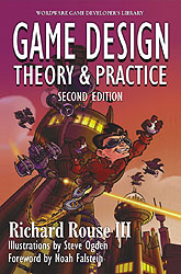
Game studies revisited: Rouse

Some time ago I had been looking at the central tenets of game design, using Jesse Schell's Art of Game Design as a primary guide.  I round this off by comparing Schell's views with those of other designers, starting with Richard Rouse.


Game Design: Theory & Practice


This book approaches design by examining existing games.  I don't know whether he intended the book to come across this way, but it feels like Rouse has used the book to take a trip down 'memory lane', name-checking all his favourite games.
Interestingly, this approach contrasts with the view stated by Neil Thompson (speaking at BAF Game 2012), who suggested that too much retrospection can lead to stagnation in design; that designers need to expose themselves to fresh, new ideas from other disciplines.
Lots of classic arcade games are reviewed, with interviews with the designers.  This is certainly insightful but also frequently irrelevant -- for example, in the interview with Steve Meretzky, there is a full page of biographical ramblings relating to the decision to develop Zork Zero, with heavy name-dropping of former colleagues from over 20 years ago.

Rouse states that players want several things:
  • A challenge
  • To socialise or a dynamic solitary experience 
  • Bragging rights (i.e. something to show off about)
  • An emotional experience
  • To explore
  • To fantasise
  • To interact
but that they expect:
  • Consistency of design
  • To understand their boundaries
  • Reasonable logic and a fair chance
  • To have clear directions and not get stuck
  • An incremental experience, without boring repetition
  • Immersion; to do rather than watch.
These seem to echo a number of Schell's sentiments, although not filtered to accomodate differences in gender or genre.

Rouse then splits the game into elements: gameplay (i.e. mechanics), technology & narrative.  He states that "Experienced game designers already understand the limitations placed on the creation of games by the technology, gameplay and story."

This reveals two startling things about Rouse's approach to game design:
Firstly, Rouse does NOT include aesthetics in his list of major elements -- with only 3 pages within the 700-page book it's clear that Rouse considers it a minor factor in level design!

Secondly, he views mechanics, technology & narrative as "limitations".  Schell takes a more positive approach, describing them as "essential", asking "Are four elements in harmony, reinforcing each other, and working together toward a common theme?"  There is a clear split in tone between the authors.
A quick look at Rouse's game design CV suggests that most of his commercial work in the last 10 years has focused being a lead designer, game story writer & occasional programmer.  He obviously knows what he's talking about, but I suspect that he may have a viewpoint biased against visual creative arts.
I find myself quite disappointed at Rouse's apparent dismissal of aesthetics.

With nostalgia forming a focus for my work, it has become clear very quickly that aesthetics are a major emotional trigger -- every bit as important as narrative in motivating the player emotionally, and adding to their subjective experience.

In summary, I find Rouse's approach in this book to be functional rather than inspirational.  There are many parts which show the procedures involved in game design, but the whole thing lacks any kind of creative spark.  A disappointment.

Friday, 16 November 2012

BAF Game 2012

This week I had the opportunity to attend the BAF Game conference, an offshoot of the Bradford Animation Festival.  Organised annually by the National Media Museum & University of Bradford, this event attracts prestigious speakers who talk about their experiences in the industry and provides an insight into state-of-the-art techniques.

I saw five key speakers, and each was fascinating in a different way:


Faceware animation software

Award-winning CGI facial animator David Bennett spoke about the capabilities of Faceware software.  This program analyses video footage and produces a semi-automated model of facial expressions, allowing them to be re-created on any 3D CGI model.


With a CV which includes working for Weta Digital on Avatar, Rise of the Planet of the ApesTintin, Beowulf and Polar Express, David certainly knows what he's talking about!  I doubt he'd describe himself as a natural orator, but his video samples certainly spoke for themselves (no pun intended).  This jaw-dropping software is already heavily used in both movie-making and game development.


The videos also included footage of a real-time iPad app, which superimposed a mask on a child's face.  Interestingly, when responding to questions, David mentioned that the company is also involved with research into using video analysis to train people to spot when somebody is lying.

Working in the games industry


Christine Phelan is a jobbing character animator who currently works for Valve.  She talked to the conference about her career path, focusing on a number of points:
  • Don't be an asshole.  The games industry is a small world.
  • Be prepared to work hard.  In the US industry, 80-90 hour weeks are not uncommon in the early stages of your career.  Once you're established, you'll be able to balance life & work in a more realistic manner.
  • Build an industry-focused portfolio.  You need to show off the skills which will be relevant to potential employers, and concentrate on your strengths.

Aside from giving an entertaining talk, Christine also emphasised the importance of a "T-shaped" skillset -- the ability to offer specialist skills in on area, but some skills in other areas too.

'Botanicula' game


Next up were Jaromír Plachý & Peter Stehlik of Amanita Design, based in the Czech Republic.  They demonstrated their point-and-click game 'Botanicula'.


This game reminded me very much of what Sheri Graner Ray said about women & casual gaming (see previous post on gender in game design).  It hits a number of key design points to appeal to a female audience, including the point-and-click interface; experimental, discovery-based adventure; and constructive social interaction.  It has also been described in reviews as "charming" and "delightful" -- something which ties in with an earlier post regarding the effect of charm.

While it doesn't appeal to me personally, what I have learned about game design suggests that it has great potential for success with a specific demographic.  The game was released six months ago for desktop & laptop platforms and it'll be interesting to see how it sells when it reaches iPad.


Creating cinematics for games


David Brown, Phil Gray are cinematic animation directors for TT Games and were joined by production manager Bill Martin.  They spoke at length about their work on cinematic cut-scenes for the Lego Batman and Lego Lord of the Rings video games.


Two points of interest stood out:
  • The switch from mime to speech.  Due to the need to target an international market, they had avoided characters speaking in earlier games.  However, because Lego Batman had an original story, they found it difficult to impart complex story detail by mime alone.  This encapsulates the eternal battle between gameplay & extrinsic narrative: with movie tie-ins like Lego Star Wars & Lego Harry Potter, players are likely to be familiar with the overarching plot, so less exposition is required.  The speech and cut-scenes in Lego Batman were necessary to form an emotional interest in the characters, and to move the story along from scene-to-scene.
  • Limitations of IP licensing.  I asked Bill whether the Intellectual Property owners interfere much with the game development process.  He answered that, thankfully, the TT developers have a good track record, so they find they're generally left to get on with their own ideas.  However, Phil identified a couple of instances where licensors had blocked specific content (such as referring to "a pint" in the LoTR 'Prancing Pony' Inn scene, presumably to avoid alcohol references in certain territories).  More often, ideas would be cut because they didn't fit the tone (such as doing Gandalf's famous "You shall not pass!" scene with him dressed as a school crossing guard, complete with lollipop) rather than because of licence restrictions. 


From Chuckie Egg to Mass Effect


Finally, we come to Neil Thompson, who's an art director at Bioware.  Neil is a superstar.  There's no other way to put it.  He overran his timeslot by 50% and the audience were begging for more.  We only finished because the University called time.

Having worked his way from the days of the ZX Spectrum (and later the Commodore Amiga) via companies like Psygnosis/Sony and Bizarre Creations, Neil has seen a lot of success and failure in his career.  Most importantly, he has learned from both.

Neil teasing the audience with concept art from Dragon Age 3.
His presentation consisted of a trawl through the history of video game graphics during the last 35 years, using examples from his own career.  He empahasised the need to take inspiration from a transdisciplinary range, and ended his presentation with a 20-minute(!) slideshow of art that had inspired him, including everything from Dali to Kev Walker (and even included some beaty shots from the recent, excellent Dredd 3D movie).


Conclusion


So, was the event a success?  Definitely.  It certainly justified the high ticket price and the two-hour knee-busting minibus trip, and I learned a great deal about the passion & creativity needed for this dynamic industry.

Nigel Slater: Life is Sweets

I've had a lot of reaction from the pictures of sheet wrappers post a few weeks ago.  It has been quite fascinating watching people explode with glee at the sight of old chocolate bar logos.  The collected images, originally created by a jigsaw company, create a cascade of excitement & reminiscence.

Last week I was made aware of a TV programme on this theme, featuring celebrity chef & food writer Nigel Slater: Life is Sweets (5th November, BBC4).

The programme is primarily concerned with Slater's personal recollections of childhood in the 1960s, and the role that sweets played. It also takes a look at the history of confectionary production in the UK, and the origins of many items as Victorian medical supplies.


Association


Slater is clearly affected emotionally by the experience of "being surrounded by all the colours and flavours of so long ago [...] immediately transported back to the days of short trousers and satchels."  This potency brings Slater initial feelings of joy, followed by pangs of sadness for events from that period in his life (such as the death of his mother, which he associates with marshmallows).
“Sweets are memorials of our innocence; they remind us of what-it-was-like when we were children.”
— Tim Richardson, sweet historian
This suggests an issue which is not addressed within the programme, but is relevant to my research: the strength of emotional reaction relates to an individual's mental associations & recollections.  It is very difficult to gauge a person's reaction to a trigger, and its relative effect emotionally, unless you are familiar with that person's emotional history and childhood surroundings.  In Slater's case, sweets resonate with troubled times of desperately seeking approval from his father, and youthful rebellion & isolation -- powerful emotions.

Therefore, if attempting to artificially trigger a reaction, we must rely upon common experiences.  For example, the excitement of buying "a quarter of..." is likely to be the same for many children of the 1960s or 1970s, regardless of what product they bought or its price -- given that such an event would be relatively exciting compared with day-to-day life.  Of course, kids who grew up surrounded by videos & computer games in the 1980s & 1990s are far less likely to have the same response.


Triggers


The retro sweet shop which he visits is interesting in itself, because it is quite evident that it has been designed specifically to reflect the mental picture of "old time" sweet shops, regardless of historical accuracy.


Long shelves of jars of sweets; a mechanical cash register; dim lighting; paper bags; old brand names & logos on display -- all these things evoke the desired response in a customer.

Of course, none of the jars contain 50-year-old confectionary!  Despite the fact that many of the branded sweets are related to the originals by name & appearance only, the effect is the same.

This reinforces a belief that I've forged during my nostalgia research: that it's vital to identify with the mental recollection that people have.  Truth & accuracy are an irrelevant distraction, unless they can add extra detail which can be exploited.

This can be seen in case of the famous Star Wars toy figure Boba Fett, which was allegedly released with a working projectile rocket back-pack.  Many people continue to propagate this urban legend, and will swear blind that they had a friend who had one.  Highlighting the fallacy of this will diminish the enjoyment of a group of 40-year-old men recollecting their common experience of playing with Star Wars toys.

Catching up


You may have noticed that I've posted only once in the last fortnight.   Don't worry!  Everything is fine: I'm still very busy, but I've been doing a lot of research, reading & thinking but just haven't typed it up yet.

Stuff lined up for the next few blogs:
  • Nigel Slater's Life is Sweets -- a look at how sweets take us back to our childhood.
  • BAF Game 2012 -- a report on my trip to the BAF Game conference in Bradford, where I saw speakers from Valve, Traveller's Tales & Bioware.
  • Whatever happened to the block game? -- an update on the situation with my experiment with a nostalgia-themed block game, which has turned into a whole can of worms.  Very interesting, and a great insight into the complexity of abstract game mechanics.
  • A scientific look at nostalgia -- investigation into formal research on the nature & effect of nostalgia.
  • Game studies revisited -- reviews of books by Richard Rouse and François Laramée, concluding my basic grounding in the common tenets of game design.
  • "You're Winner!" (sic)
    Pomagne & Metal Water Jugs -- the primary school Summer Fete & Christmas Grotto, with spin-the-wheel and electric-buzzer-wire game; school dinners, with pink blancmange, semolina and those mysterious dark pink (or gold) brushed stainless steel water jugs.  An examination of the relative power of obscure & hard-to-get items, and how they affect the intensity of the nostalgia 'gag reflex'.
  • Period aesthetics -- how to simulate the 'look' of particular periods of time.
As you can see that's a fair quantity of stuff.  I've also got a big Literary & Contextual Review to write during the next three weeks, so I'm going to be a very busy boy...

Friday, 9 November 2012

Very big long words


Phenomenology


Blimey!  You know you're getting serious when you start bringing the existentialist mumblings of Jean-Paul Sartre into Games Design research...

Anyway, today I was introduced to a concept new to me: Phenomenology.  In very simple terms it's concerned with analysing feelings in a structured way, while avoiding the scientific stuff associated with clinical psychology (e.g. neurological endorphin triggers).

I want this on my bookshelf!
It will make me CLEVER!
The phenomenological* approach (*note to self: don't try typing that after a few ciders) can be used as a qualitative method in formal research. 

This is useful, because I'm examining the effects of nostalgia as a motivational tool in games design -- and player feelings play a fairly big part in that.


Subjective experience


At last!  I've struggled for months with the word "experience" (see earlier post).

It's an ambiguous word, and means I can't talk about a player's experience (i.e. experience-gained-from-playing-my-game-now) without it getting confused with a player's experience (i.e. prior-experience-that-helps-them-play-games).

We had a lecture today from fashion designer Fiona Candy where she used the term "subjective experience".  Wow!  That hits the spot perfectly.  I now have a phrase I can use which explains what I, concisely yet accurately.  I'm a happy bunny!

Friday, 2 November 2012

Choosing a Game Engine

As mentioned in my previous post, I'm going to create a clone of the Escape! game as a means to investigate the emotional effect of product placement (with a view to eventually using this in the context of nostalgia-themed games).
For any blog followers who are unfamiliar with the term game engine, I should probably explain what one is!

A computer game needs program code which draws the images on screen, and which calculates things (like how far an object has moved, or whether a missile has hit an alien).  This program code is a common feature of many games, so companies tend to lump this code together as an 'engine' which can be re-used again & again.

This approach also splits the majority of the programming work away from the design aspect, meaning that designers can focus on what they do best!  Game engines usually include extra facilities to make it easy to organise pictures, sounds, game rules, maps, etc.  Hence a game designer will tend to build their game around an existing engine.
My normal engine of choice is Unity.  However, Unity is a 3D engine and therefore adds extra complexity when building a 2D game.  There are many 2D engines available, so it makes sense to use one of those.

First thought was GameMaker, which I know well.  However, there's a new 2D engine on the block -- Construct 2 -- which is getting a lot of good buzz.  Even better, its free (so long as you're not using it on a large scale commercially) and will create games which can be converted for mobile phones & tablets.  So, I thought I'd use this project as an excuse to learn to use Construct 2.


Persuasive Games

In the background to the nostalgia research, I'm still working my way through books on the general principles of game design.

This post concentrates on "Persuasive Games: The Expressive Power of Videogames" by Ian Bogost.  Bogost specialises in games about social & political issues.


Procedure & Rhetoric


Bogost starts by defining two terms:
  • Procedure -- "a way of creating, explaining or understanding processes" (where 'processes' refer to the operation of systems ranging from mechanical to religious concept structures).
  • Rhetoric -- "effective and persuasive expression"
These are then combined to form procedural rhetoric, which is "the practice of using processes persuasively".  He gives the example of an interactive multimedia program which allows users to design packaging for a breakfast cereal; by following a series of cues, the user selects colours and illustrations (e.g. "orange is associated with appetite", "green with nature & health").  The aim is to educate children into recognising the manipulative techniques used by manufacturers & advertisers.


Persuasion


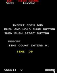
Games make use of persuasion for different purposes.  One major goal of arcade games is to get 'coin drop' -- in other words, to make money.  One tactic used is the option "Insert coin to continue" which uses the incentive of further exciting gameplay without having to regress to the start.  To pressure the player into an emotional decision (which gives increased likelihood of a positive reaction), this is often a limited-time offer accompanied by a countdown clock.

Bogost also focuses on the use of persuasion to emphsise political & social messages.  However, as this is not relevant to my main study I have skipped this.

Licensing & product placement are certainly big areas.  Bogost illustrates the power of licensing through the example of Harry Potter video games.  Many of these games re-create scenes, allowing the player to re-experience favourite sequences with a little interaction (something of note for my nostalgia research).  Some offer teamwork exercises, others have sub-goals focusing on the minor aspects of the Potter universe (such as collecting Bertie Botts' Every Flavour Beans or mixing potions).  What is interesting is that most of these games add very little that is new to the Harry Potter experience.
It's my observation that product placement has significant overlap with licenced/franchised intellectual property (IP), but specifically offers an opportunity to drop messages into a game which might not otherwise be included.  For example, if a car street-racing game includes an advertising hoarding for Red Bull energy drinks, the player is likely to subliminally accept a connection between the brand and the excitment, hipness & coolness of motor racing.
Aesthetically & narratively abstract games (such as Pong) can be easily adapted into tools for persuasion by the simple addition of images or extrinisic backstory which link the game to a particular product or message (so long as this is reasonably compatible).


Practical application


This book has provided some valuable insight, and had also prompted an idea (see previous post) of using the abstract Escape! block-dodging game to investigate the psychological effect of adding visual product placement.

I intend to investigate three variations:
  1. Plain, abstract graphics
  2. Gratuitous product placement (e.g. company logos)
  3. Game-mechanic-related product placement (e.g. Vince Vaughn character avoiding bouncing balls, mimicking the sports gameplay within the movie Dodgeball.)
I anticipate that '2' will produce some initial emotional reaction, and that '3' will produce an increased & sustained emotional reaction with players who are familiar with the movie.  It'll be interesting to see how this plays out.

Nostalgia Research Update

It's been a bit quiet on the blog this week, but don't worry -- there's a lot of work going on behind the scenes.  I'm currently purusing three strands of research to support my general theme:
  • The effect of nostalgia & techniques which trigger emotional reaction -- a study of works on these topics (from a formal psychology standpoint).  This will likely form part of the Literary Review which I have to submit in December.
  • Effect of isolated aesthetic nostalgia cues -- adaptation of a (very simple game) to experimentally examine the effect of isolated aesthetic nostalgia cues.  I'll be creating two games: one will be a simple, plain (abstract) version, and the other will be the same game with different, nostalgia-themed graphics.  I'll try both with test groups to examine the different reactions.  This will likely grow into a key part of my main research project.
  • Continue with collection of potential nostalgia cues.  The list is growing!
I'll publish more as these develop.

Saturday, 27 October 2012

Nostalgia & Comics

I've been drawing up a list of potential themes for a nostalia-based game design, just to test the water.  The list has got very long very quickly, but I've learned a number of important things in a very short time:
  1. Trademarks feature prominently, which means there's a major need to create generic versions (or spoof imitations of) products to avoid clearance costs.
  2. Many nostalgic characters & objects are still current.  The toy comanies know when they've got a hit and they'll milk it for as long as they can.  Whether it's Teenage Mutant Ninja Turtles or Transformers, some nostalgic content has been done to death already.
  3. "I'd forgotten about that!" is a powerful emotion.  Taking Koster's Theory of Fun into account, there is undoubtedly a strong chemical process involved in rediscovering atrophied chunk memory.  Prehaps the endorphins flow at a greater rate along the already-formed neural links?  Whatever the neurophysiological explanation, this feeling is definitely fun.
  4. Toys & sweets run all the way through.  However, for kids from the 1970s, comics & TV are prominent; for 1980s it moves on to films & early 8-bit video games; by the 1990s there is a heavy emphasis on branded characters (cartoons/toys) & 16-bit video games.

As I've noted initial ideas for game spin-offs, I've also realised that there is a pattern to the themes.  Some appear to be mostly about aesthetics (e.g. Space:1999 or Fuzzy Felt) and have little actual content that would drive a game mechanic (which doesn't stop them being useful).  Others have core factors -- "why we loved them" -- that can be exploited as the core concepts in a game.  Many, as mentioned above, need to be converted into an unbranded imitation or gestalt.

Once the useful factors are established, these can be used to drive the game design process.1970s kids' comics are an interesting difficulty here.  They are packed with high-concept characters (mostly copyrighed, but that shouldn't be a problem, as parody comic Viz discovered a long time ago) and situations which drive a narrative well.  However, they require a very specific art style -- like that of Leo & Martin Baxendale or Tom Paterson -- in order to take advantage of the nostalgic cues.  This would undoubtedly require specialist help, possibly from experts in this field like Lew Stringer.


This raises a thought: is it possible to develop a list of steps which can be used to convert any nostalgic theme into a viable game?  I suspect that it is possible, and that this is a potential research question.

Friday, 26 October 2012

Deciding on a focus

I'm now several weeks into my MA and have covered a lot of ground, working my way through many of the fundamental theories of game studies.  At this stage I still have a number of potential topics for research, so I thought it was worth listing them to help me identify the direction I'm looking to take.
  • Which elements are important in creating an effective casual gaming experience?
  • Something involving game mechanics (giving a main hook to hang the the game on), intrinsic narrative (added by the player), and charm (part of the hook and tying in with the mechanic).
  • Can nostalgia be exploited reliably in order to add charm to a game?
  • Is it possible to define a set of 'filters' which can be used to refine a game during the prototyping process?
  • Is there a role for 3D printing in video games?
  • Development of immersive play games & virtual play areas, based on and controlled by real-world artefacts.
  • Does an understanding of object-oriented techniques assist the game designer in developing effective game mechanics?
After discussing these different topics with MA Games tutor Josh, I managed to write a couple off.  Josh felt that the object-oriented one was a dead end, because it would cause designers to pay too much attention to irrelevant technical details -- I agree with his reasoning there.  The casual gaming thing has potential but I've been finding myself moving further away from it as time moves on.

That left the charm & nostalgia ones (which overlap significantly) and the 3D printing & "real world meets virtual world" options (opposite but related).


Bringing the game into the real world with 3D printing


Josh gave me a tour of the School's state-of-the-art rapid prototyping 3D printing facilities and I was blown away by the quality of the rendered models on show.  Different plastics, wax, foam and resin printers are available.  Some of these printers can inkjet-print a coloured texture onto the surface of the model.  Quite amazing!

A powder-based ZPrinter like the one at UCLan

I suspect that, just like home printing & photocopying, we will see cheap devices in the home within 5 years, and high-quality systems (like the ZPrinter above) in the local high street (similar to the rise of companies like Prontaprint, which sprang up to offer photocopying services) very soon.

After seeing these facilities it became clear that not only is this a glimpse of the future, but also that any advances that I would be able to make in this area would be quickly swallowed by the pace of consumer adoption.  For this reason I feel it would be best focusing my time on the charm / nostalgia issue instead.


Charm / Nostalgia


One of the running themes in this blog has been the idea of charm, and how it can make an object or a game much more emotionally enjoyable.  Nostalgia can play a large role in this too, and brings with it a ready-made affection for a product.  If that product can capture the spirit of the original (not just the look & feel), then it will have already won the heart of the player.

Objects with charm often have their own built-in mechanics (or associated rules) and aesthetics.  This is especially true of toys.  They also come with a period environment, which can be used to reinforce the nostalgic feel.

A perfect example of this environment is the BBC's 2006 TV series Life on Mars, which was not just content with recreating the look & feel of a 1970s TV copshow, but also included bonus items such as old-style Lucozade bottles (with plastic cellophane wrap) and mock-up clips of childrens' TV shows of the time (such as Trumpton).  These smaller touches in some cases generated more excitement in viewers than the rest of the episode.

At this stage I have not yet formed a rough question to answer in this arena, but expect to have something nailed down within 7 days.  I also intend to create a very rough game idea based on a nostalgic item, in order to establish the notion within a games context.  This is now starting to find a clear direction.

A Theory of Fun

In this post I'm taking a look at the book "A Theory of Fun for Games Design" (2005) by Raph Koster.  Koster is a designer of MMO games and played a major role in developing Ultima Online (still going after 15 years) and Star Wars Galaxies (which ran for 8 years).


He starts by looking at the brain's pattern-matching process and the way we learn to model the world around us by identifying common features.  (If this sounds familiar, it's because we talked about this in a recent post).  He ties this to 'chunking': the way in which repeated routines are linked in our brain (by increased weight to pathways between neurons, if I remember my A.I. lectures of 22 years ago correctly).

Koster states that we get a chemical kick (via endorphins) "at the moment of triuimph when we learn something or master a pattern".  It's this that is the primary way of having 'fun', whether it's learning to fit shapes together, working out which aliens to shoot in order to survive, or developing a successful method for getting a frog across a busy road.

Unfortunately the chemicals wear off once we've finished learning, and that's when boredom can set in.  (Interestingly, this brings us back to flow (see this post) and the need to balance challenge & skill -- or new learning versus existing routines.)

Koster argues that game-players quickly move past aesthetic & narrative flourishes to recognise abstract patterns in a game, and uses Deathrace & Grand Theft Auto to argue his case that the story & setting are a "side dish" to add some variety to the learning process.  (This comes back to the ludology vs. narrative debate.)  Bizarrely, he contradicts this stance later in the book when arguing that a game is not just about mechanics but about the whole, illustrating this with the suggestion that a humans-falling-atop-one-another-in-a-gas-chamber game would be morally repugnant, yet would essentially be Tetris in practical terms.

The book looks further into specific contexts of learning, including social & visceral aspects.  However, by this stage Koster has lost me as an audience.  Maybe, ironically, it's because I don't think I'm learning anything new from him.  Mostly, though, I think it's because his analysis is a little too idiosyncratic, adding descriptive flourishes that try to be 'fun' in the wrong way -- a bit like when people want to add 'fun' to Maths to make it appeal to a wider group, yet miss the idea that maths itself can be fun.

This hasn't been a wasted exercise, though.  I've learned that the endorphin-producing "aha!" event is important to the enjoyment of a game, and have seen Schell's ideas on modelling & flow reinforced.

The Art of Game Design (part 6)

In the previous part of our look at game mechanics we covered rules.  This final section features skill and chance.


Skill


Depending on the game, the player may need physical skills, mental skills or social skills -- which may be further sub-categorised (e.g. mental = memory, spacial, pattern-matching, etc.).  When designing a game, Jesse Schell recommends making a list of the specific skills that will be required.

This is more important than it sounds.  For example, Big Brain Academy for the Wii (one of the major "brain training" games popular five years ago) covers a range of mental skills; however it also requires users to accurately point a Wii remote at the screen to control a cursor, which must be moved at speed to select items in a timed game.  These two skills are very different, and people who are good with their minds may struggle with the physical aspect and become frustrated.  It's apparent that the makers of the game felt it was a risk worth taking to appeal to a more mainstream audience.


Chance


Schell argues that games need some element of chance to be fun.  He links skill and chance, explaining how skill levels can introduce an element of chance (otherwise games like ten-pin bowling would be pretty boring).

His most important observation is that expected value is important to the player.  This is the average 'win' for the player.  In most casino games, the odds are stacked to ensure that a player will, on average, walk away with less than they stake -- not much of an incentive!

The skill of a designer lies in making this more attractive to a player, by balancing the odds carefully.  (In the case of a casino, this average loss is kept to an optimal level to avoid deterring players; they also apply clever psychology to emphasise high potential winnings as a counterbalance.)

Expected value can be used to motivate a player: if they feel they should have won, yet have lost, they feel a need to prove themself.  In the case of Windows solitaire, the 'Vegas' scoring system is carefully balanced to encourage a player to play another round in an effort to recoup their losses.


What have we learned from this?  Well, skill and chance play an important role and cannot be ignored.  Most importantly, a poor balance of skill or chance can scupper a game.

Defining Game Mechanics

While reading around the topic of game mechanics for recent posts, I came across an article by Dr. Miguel Sicart published in Game Studies, the international journal of computer game research.

This article, entitled "Defining Game Mechanics" (2008), does what it says on the tin: it develops a definition of the term 'mechanics' for use in game analysis.

Although it's important to identify things in order to analyse them, I've already seen that it's easy to get hung up on terminology and definitions.  Therefore -- so far -- I've been looking predominantly to gain an overview of the major aspects of design rather than get bogged-down in detail.

However, something about the article caught my eye and I though it worth taking a closer look.


Sicart begins by examining previous studies of mechanics.  He shows that many academics define mechanics as a sub-set of the rules of a game, with copious debate over how much these rules affect a player.  He goes on to examine other viewpoints, including the focus on the use of verbs (such as "take cover" or "repel") to describe these mechanics.  He concludes by arguing that some games (specifically god simulators or sandbox games) do not fit this definition, and sets out to form a better one.

This is where it gets interesting: Sicart connects the mechanics directly to objects and actions; specifically, he equates actions with an object's methods (i.e. the things you can ask an object to do).

These aspects were all mentioned in part 4 of my post on the Art of Game Design book, and validate my comments about actions & methods.

Why is this important?  Well, it means that mechanics can be specified in a manner which is immediately compatible with (object-based) game engines.  This improves communication between designers and programmers.

It also explains why it is important that game designers, who are not usually versed in computer programming, should be introduced to the object-oriented paradigm.

I wonder how far this should go?  Do most game designers need to understand other OOP principles such as inheritance and polymorphism?  I suspect that it can be an advantage, and will keep an eye out for this in the future.