In my
previous post I looked at how to achieve a 1970s
mood visually. This time I'm looking at the 1980s.
The first thing to note is that I'm deliberately
avoiding iconography -- so no
Rubik's Cubes,
New Romantic pop posters or
asymmetric hairstyles. Instead I'm trying to suggest the period by use of colour, decoration and lighting; to provide a context for other items.
I'll start by looking at others who have tried to conjure that period visually in
pastiche. (This gives a quick route to identifying the common
signifiers, and saves re-inventing the wheel).
First up is the 2008 TV series
Ashes to Ashes, in which detective Alexandra Drake was transported back through time into a stylised world of policing based on shows like
The Gentle Touch,
The Professionals and
Dempsey & Makepeace.
 |
| See the programme intro here. |
Next is the cult phenomenon
Garth Merenghi's Darkplace. This series captures many of the stylings associated with cheap VHS horror movies.
This even continues to the DVD cover which does a cracking job of capturing the "airbrushed glow" look of posters from this era.
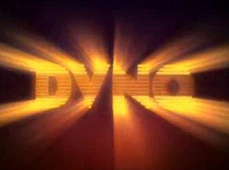
Talking of VHS (and on a general graphic design theme) next on my list is
Justice's DVNO music video (2007), produced by the
Machine Molle animation & VFX company. This video takes song lyrics turned into the kind of animated logos associated with companies like HBO, CBS Fox and Cannon Films during the 1980s.
Analysis
To achieve a 1980s look, a number of factors need to be included:
| Signifier: | Black |
|---|
| Why? | In the 1980s, black was the new brown. Film & video from this period is generally better preserved than 1970s stock, so the blacks are also a lot darker. There is heavy use of darkness and night-time as background (as opposed to the sunny look of the 70s). |
|---|
There were quite a few movies & TV shows in the 1970s with night-time scenes, but this seemed to become the prevalent look in the early 1980s.
 |
Night-time scenes became more common in the 1980s,
as demonstrated in this still from Joe Jackson's Steppin' Out music video |
| Signifier: | 80-85: Undersaturated colours (especially reds & blues); gold; black & white in contrast;
85-90: Pastel shades, overlit. |
|---|
| Why? | The 1980s palette is much wider than the previous decade; although primary colours are evident they are not vivid. This may be due to degradation of video tape (on which many programmes were shot, to save money). |
|---|
Here's a couple of examples of this in action:
 |
Gary Numan, performing his Telekon album live.
Note the muted red in contrast to the black. |
 |
Larry Blackmon from the band Cameo in 1986, with trademark red codpiece.
Note the pastel shades (behind) starting to come in. |
The image below is from the 2005
Doctor Who episode
Father's Day, which portrayed a wedding in the late 1980s. Although the general filming style of the episode fails to capture that period look, the make-up, hair and clothes do a good job of following the pastel colour scheme associated with the latter half of the decade.
| Signifier: | Stripes! Stripes! Stripes! |
|---|
| Why? | In clothing, coloured stripes were fashionable, usually in contrast to black or white. |
|---|
The image below shows a number of elements in combination: red-and-black striped leotard (note the muted red); and black leg-warmers and footless tights.
This also extended to lighting: with the emphasis on darkness, scenes are often lit by light coming through blinds or bars.
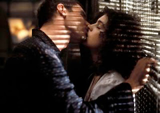 |
The "lit through blinds" technique just screams '80s
in this scene from Blade Runner. |
| Signifier: | Glow |
|---|
| Why? | Although airbrushed artwork had been around during the 1970s, the effect started to move into video work in the following decade. Cartoons like He-Man and the Masters of the Universe featured glowing magic |
|---|
Cartoons like
He-Man and the Masters of the Universe featured incandescent elements as a matter of course, and most logos were not complete without an edge glow.

Next time we'll be looking at the difficult-to-pin-down 1990s.