Thursday 31 January 2013

Pinball Piano

As regular readers will know, I'm currently developing a pianola-themed game.

While researching the topic, I came across a sound installation created by audio artist Lucas Abela.  He is certainly quite inventive: there is a quite mad clip of him playing a sheet of glass with his mouth on YouTube, which has to be seen to be believed.

Anyway, Abela has created a piano-based pinball table.


The work goes under the title "Pinball Pianola" but does not actually involve a pianola.  Instead, he appears to have used the word to imply mechanisation, and to evoke the "stuff going on" meaning associated with the suffix '-ola' (like payola or crapola).


Abela states:
I’ve devised a Frankenstein experiment, combining the greatest musical invention of all time, the Piano; with the coolest amusement machines ever conceived; Pinball, to create an interactive sound installation like no other;

‘Pinball Pianola’, a musical device constructed by replacing the keyboard, hammers and front paneling of an upright piano, with a pinball cabinet butted up perpendicular against its exposed strings. Embracing high and low culture this instrument allows virtuosos and wizards alike to pit their skills in a game where musical compositions are created as metallic balls jettisoned into the game clash with the pianos resonating wires.

This experiment the first of in a series of individually crafted instruments [...] that introduce musical elements into the iconic game of pinball, making sound generation – not scoring – the games’ main objective.
This inventive use of a piano as both game and adapted musical instrument is technically impressive and also exciting as a concept in relation to my project work.  Pinball is an angle I hadn't considered, and the use of strings as stationary targets and piano keys as flipper controllers is inspired.

From a gaming perspective I'm sure there is potential to use hammers as kickers, and a host of other ideas too, based on this theme.  Given the wide range of themes for pinball games, I'm surprised that further research has failed to find any other pinball games based around a music instrument theme.

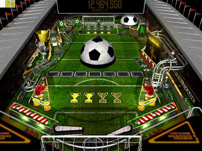
Whether physical of virtual, there are plenty of novelty pinball games, ranging from football (where presumably the ball looks like a football) to a K'nex-constructed roller coaster.

The great thing about pinball as a basis for a game is that it's readily understood.  For some people a pinball table it may act as a nostalgia trigger, but their long-established nature means that they lack the strong "I haven't seen that in years!" affect which I'm aiming for.


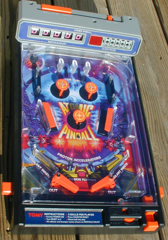
With regards to my own game, the idea of mixing pinball-style physics into the equation is certainly an interesting one.

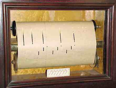
Rather than mimic Abela, I'd prefer to keep the automated playing of the programmed music reel, perhaps creating a wall of piano keys which move, affecting the movement of the ball.


This concept has the strong advantage of mixing familiar elements together.  Certainly something to think about as I develop my potential ideas for a game.

Wednesday 30 January 2013

Gaudi vs. London Underground

Following on from my recent botched attempt to moan about architecture, I found myself watching two very interesting TV programmes about the subject.  Reflection on these led me into areas which emphasised the importance of a cross-disciplinary and open-minded approach within design.

Gaudi

The Sky Arts documentary Gaudi's Barcelona was quite eye-opening.  As I've stated before, I've always disliked his work but respected it at the same time.


Within the programme the organic nature of Gaudi's designs shone through: emphasising irregularity, asymmetry, and natural form (trees, bones, etc.) and occasionally a "Dr Seuss" colour scheme.  Not only the buildings but also the furniture within; the windows latches; everything.  Hand-carved, unique.


This particular hand-carved, every-item-unique, styling reminded me of the seminal science fiction novel The Mote In God's Eye, which describes first contact with an alien race -- Moties -- who have evolved with an asymmetrical body.

Their fictional civilisation is extremely well-realised and carefully-thought-through, describing an approach to engineering which is similar to Gaudi's: each item they make is unique and suited to purpose.  Additionally, they have a habit of quickly dismantling, recycling and scavenging materials when constructing new objects.

(This detailed approach to xenoanthropology is similar to the work done by fellow MA Games Design student Steph Brookes, who develops new animals based on the needs for them to survive in "real life".)

The natural form of his work is also evidenced within his Neo-Gothic and Art Nouveau inspired designs like the Sagrada Familia church.  My immediate reaction when seeing this was to recall the insect-derived Geonosian architecture from Star Wars Episode II: Attack of the Clones.  I suspect that the latter takes its cues from nature, influenced by Gaudi's work.


This outer appearance belies the clever structural mechanics which support his designs.

The documentary makes clear that Gaudi's highly indulgent designs are a result of extensive sponsorship by wealthy individuals who appreciated his art.  This is, itself, interesting.  My limited knowledge indicates that ground-breaking designers & artists usually struggle with the requirement to conform to commercial necessity, and that it is only financial support like this that allows truly visionary work to thrive -- risking failure as well as success (a good example being Stanley Kubrick).

Do I like Gaudi's work any better as a result of this documentary?  No, I still dislike it.  But I am now convinced more than ever that the man was a genius.


London Underground

The BBC4 programme Art Deco Icons: London Transport (see clip here) examined the mass-branding of the London Underground system in the 1920s, from architecture to signagetypography.

Its Art Deco styling stands in stark contrast to Gaudi's work: everything is regular, symmetrical and formal, emphasising the Machine Age.


This fascinating documentary examined everything from the underlying philosophy of the branding, overseen by Frank Pick (who acted somewhat like Gaudi's sponsors in making the whole grand scheme possible), all the way through to poster design and how it reflected the change in society and work patterns.


The beauty of the sleek designs -- the inhuman Kraftwerk-like Modernism -- really appeals to me, especially because it has a warmth rather than the coldness associated with industrialisation.


The juxtaposition of these two different approaches, separated by only about 20 years and sharing some historical common ancestry in places, highlights the way that a single philosophical goal (nature-inspired form, in Gaudi's case, and machine & geometry-inspired, for the Underground) can have a dramatic effect on a series of designs.

Within the Underground programme, one piece of background music jumped out at me: Steve Reich's Piano Phase.  This minimalist piece involves two pianos playing the same sequence, slowly phasing out of sync with each other.  The effect is to create a changing pattern of rhythms, which suited the images of ant-like commuters climbing on-and-off trains.


I had come across piece this in my teens, and the phasing idea resurfaced when creating music for an experimental recording (testing a digital studio set-up) that I made in the late 1980s under the band name Airport Convenience.  Titled "Dinnertime", the voices are mostly students from Pembrokeshire -- with the exception of a heavily re-edited Richard Burton (an uncanny coincidence given my recent War of the Worlds post) and myself ("I can't take it no more").


Why post this self-indulgence on the blog?  Well, in my particular role as a game designer I've taken on the mantle of being a one-man development team, and this has led me to start working on creating my own game music. And the last time I wrote any music in a serious manner was back at the time I recorded "Dinnertime".  Funny how things come round like that. 


Saturday 26 January 2013

Design Process

The British Design Council have a model which describes the design process.  This has come up in conversations a number of times recently, so I thought it was worth describing it here because it's pertinent to the MA.

The first thing to remember is that this kind of model represents an analysis rather than a rule.  It has been formed by examining a number of prominent companies (in this case, they picked firms like Lego, Microsoft, Sony, & Xerox) and looking for a common pattern in the way they do things.

(These analyses are interesting in themselves -- the Microsoft article explains the thinking behind Office 2007 and its infamous ribbon bar interface, and demonstrates a staggering arrogance on the part of their designers, aiming for a simpler interface by removing (useful) advanced features rather than just hiding them.)

The design process model is known as the 'double diamond'.  The image below is my own adaptation of their diagram, showing the role of the brief more clearly.


Although it's not stated on the diagram, the whole process usually starts with a problem that needs to be solved.

The first phase -- Discovery -- deals with research & brainstorming, including market research and an analysis of user needs.  As this stage progresses, the number of options available will expand rapidly, driven from the initial brief.

The second phase -- Definition -- begins with a feasibility review, which will start to filter & discard ideas which cannot be carried forward.  This may come down to cost or materials, or time.  Anything which deviates from the brief will probably need to go, too.  This may include pitching & prototypes, and concludes with a small number of ideas to be offered as a solution to the problem specified in the brief.

Development takes an approved & signed-off idea and starts to go into details.  This may lead to a number of prototypes or demo versions, which will need to be tested & reviewed.

Finally, the product is delivered.  At this stage it is necessary to reduce options, and select the version which will be delivered to the client or customer.  Additionally, this will often require the setting up of a feedback system to help evaluate the effectiveness of the solution in its real-world use.

This is not the only model to describe a design process, but it dovetails nicely into the spiral model (previously posted here) which describes the rapid application development iterative design process, common in computer programming.


Here, the whole double-diamond process will be repeated -- in differing levels of detail -- in each full rotation around the centre.

These models are useful, because they present a framework when planning a project, and highlight the importance of milestones (e.g. feasibility review) on.

Friday 25 January 2013

Patterns in Game Design (part 1)

The book Patterns in Games Design, by Staffan Björk & Jussi Holopainen, examines frameworks for analysing games.  More specifically, they offer models for creating games, based on those analyses.

In this series of posts I'll be looking at their ideas.

Activity-based framework

This model begins by splitting the game into states, and grouping these under four categories:


Holistic items relate to the whole game, and how it is initialised and played.  This is divided into game instance (the context), game session (each player's journey through the game), play session (each turn, or section such as a level) and extra-game activities (such as high-score tables or customising the game appearance).

Boundary items specify game mechanics: rules, modes of play and goals.  Goals are vital in any game, as they introduce structure.  Modes of play are best illustrated by Pac-Man, where the player is chased by ghosts for much of the time; however, at certain points the play switches mode and the player chases the ghosts.

Temporal components relate to the flow of the game.  This encompasses actions (active decisions by the player), events (automated responses to decisions), closures (changes of game state), end conditions (such as all players finishing), and evaluation functions (algorithms which calculate when closures or end conditions should be triggered).

Finally, structural components are about the people and technology: facilitator (e.g. banker in Monopoly), players, elements (board, pieces, weapons, environment), interface (control & feedback) and game time. This last one is not always needed.

This is an interesting analysis, but I don't know how useful it is.  As mentioned above, the authors use Pac-Man as their example. However, I suspect that it is better suited to board games.

Pianola game concepts (part 2)

Over the last couple of weeks I've been working on ideas for a game inspired by the pianola (also known as a player piano or self-playing piano).

The previous post introduced two concepts which had fallen out of my brainstorming process: graphical sequencing and programming-based games.  This post considers another couple of items...

Interaction with the piano

As a machine, a piano shows great potential as a sandbox for play.  Indeed, the pianola has even greater potential due to the sheer number of moving parts (adding bellows and drums).


My first exposure to this idea came from the Tom & Jerry cartoon "The Cat Concerto", created by Fred QuimbyHanna/Barbera in 1946, in which the two characters interact with piano keys, hammers, strings and piano lid whilst Tom attempts to play a piece by Liszt.  (The intricate and carefully-synchronised animation is still seen as a masterwork 67 years later, and few modern animators would attempt it without the aid of 3D CG models.)


(By "sheer coincidence" (a subject of legal debate), Warner Bros also released a similar Looney Tunes cartoon with Bugs Bunny the same year.  The legacy of both was referenced in Who Framed Roger Rabbit during the 'Donald Duck vs. Donald Duck' piano sequence.)

The idea of interacting with moving piano keys (and the rest of the mechanism) was also explored in the music video for Fatboy Slim's "Demons", featuring guest vocalist Macy Gray.  This gets a little abstract, but shows how the idea does not need to be limited by physical characteristics.


This particular video led me to consider the way in which a piano keyboard could turn into a platform game of some kind, controlled by the music roll.  This is a strong contender for the final game idea, and shows great flexibility and promise.

Traversal games

We take platform games for granted nowadays, but the groundwork for side-scrollers like Super Mario were laid a long time ago by things like Jungle Hunt and Hunchback.


In these games the player must traverse an assault course.  The idea comes full circle with the Japanese TV show Takeshi's Castle, which features an assault course based on platform games!


One genre of traversal game which proves popular with my teenaged students are those based on motorcycle trials games, based around moto-cross motorbikes or BMX bicycles.  These require the player to guide a motorbike over obstacles and often require a combination of balance (controlled by adjusting the rider's position) and speed.


Throwing in a nostalgia trigger, blog readers aged over 40 will remember the BBC TV shows "Kick Start" & "Junior Kick Start" presented by Peter Purves...


One of my possible ideas for a pianola-based game involves the player traversing a piano keyboard as a tune plays.  The player could face a series of obstacles, and be lifted (or thrown) into the air by keys as they move up-and down, and there would be an element of timing based on reading the notes in advance on the piano roll.


An alternative idea involves the player pre-programming the roll, to force an object along an assault course.  The disadvantage to this alternative idea is that the tune produced would be horrible!

Of course, these ideas are just the first to leap out from initial brainstorming.  There may be a number of other potential mechanics to explore, but these certainly start the ball rolling.

Thursday 24 January 2013

Pianola game concepts (part 1)

Over the last couple of weeks I've been working on ideas for a game inspired by the pianola (also known as a player piano or self-playing piano).

Brainstorming

The normal process of brainstorming involves throwing everything (including the kitchen sink) at the wall and seeing what sticks.  However, in this case, I've found that some concepts have really caught my attention at an early stage -- as a result, this mind map represents a summary of the brainstorming process: 


If you enlarge the picture you'll see that most concepts have been split between "piano keys" and the other on the notion of "programmable machines".

So which concepts jumped out at me?  Let's examine the first couple:

Graphical sequencing

Firstly, there's the connection between the graphical sequencing found on punched cards and that found in singing & dance games.  I've already mentioned this in a previous post, but it's worth re-iterating it here.


Most of these games require players to follow an on-screen sequence as it is revealed -- usually, this sequence scrolls (just like the paper in a pianola): vertically for dance games, horizontally for music games (usually mimicking the notes on a musical score).

Programming-based games

Secondly, there's the programming element: creating a sequence of instructions which will be executed, in order.  There are two approaches to this within existing video games.

The first method uses pre-programmed trial-and-error puzzle games.  The player creates a 'program' and then executes it, watching the results.  If the program fails to work, the player amends their program and tries again.  Examples of this include:

Cow Maze -- a popular online Flash game, written in German and never really translated for a mass market. (Not sure why, because it's a lot of fun).  Place arrows on the map and set the cow walking.  However, there are a limited number of arrows, and they only point in certain directions.


Light-Bot -- this online Flash game requires players to create a sequence of instructions (using the commands forward, left, right, jump, etc.) which is then executed to move the robot around objects to a final goal.  This also, cleverly, allows players to create re-usable subroutines, where new commands can be created, based on a small sequence of existing commands.  It's so good I actually use it when teaching programming to students -- it does a fantastic job of preparing them to think like machines, breaking tasks into steps, and also shows that it can be fun.


Professor Layton train mini-games -- the Professor Layton series of games for the Nintendo DS are extremely popular (13 million sold), and this mini-game requires players to click points on a grid map to lay a train track.  The train must pass through waypoints to reach a final goal, but must do it within a maximum number of steps.  Once the track is laid (in 2D, from above), the game shows a cute isometric projection of the train's progress as it follows the track.  An added challenge is that the length of the train increases in later levels, bringing the problem of it crashing into its own carriages.


The second method uses live, interactive programming.  In these games, the player must lay out a sequence of instructions under time pressure, often after the execution has started.

Pipe Mania -- this game was published 23 years ago by LucasArts.  In it, the player must drop sections of shaped pipe into a grid, providing a path for slow-flowing 'ooze'.  Players must also navigate the pipe around obstacles and through waypoints, but are hampered by the selection of shapes on offer.  A number of clones of this game have been produced over the years, for a variety of platforms including modern 7th generation consoles and set-top boxes.


You can see that programming, as a concept, has great potential within games.

We'll continue looking at the concepts which "jumped out" in the next blog.  See you soon!

Friday 18 January 2013

Land of Lost Content

My friend Jes has been a superstar!  Why?  Because she has introduced me to the Land of Lost Content!


This museum is based in Craven Arms, Shropshire, and claims to be the largest archive of 20th Century popular culture in the world.  Wow!  This appears to be a treasure chest of nostalgic items.


This is likely to prove an invaluable resource for my research, mainly because it will provide a number of triggers for development of game ideas (just like the pianola did) and may also provide visual content for "trawled" nostalgia games (such as my yet-to-be-developed "I Love The '80s" game concept, or point-and-click hunt-the-object casual games).


Fashion designer Wayne Hemingway has become involved with the collection, creating a digital archive of the content.  At present this is available only to "students and academics from subscribing institutions" so I'll need to investigate further.

With half of Britain covered in snow, I'm unable to visit this fascinating attraction but will update the blog with more information when the opportunity allows.

"I want another go"

Some months back I mentioned the notion of coin drop.  The term refers to arcade games, where a player is offered the chance to continue their game ... so long as they insert a coin within 10 seconds.  Essentially, it's a compliance-based pressure sales tactic.


TV masterpiece The Wire introduced me to the notion that American newspaper journalism can be pretty good stuff, and I started reading some of the quality US newspapers online.  Despite being highly parochial, I've found them to be a very interesting source of information.

A recent article in The New York Times, entitled "I'm losing money. Why do I feel so good?", examined the psychology of gambling addiction and the ways in which casinos are using modern digital technology to manipulate players.

One major trick is to make players think that they've almost won.  This is far easier with digital devices, because the designer can cheat by forcing events rather than waiting for them to occur randomly.  For example, on a mechanical fruit machine the odds of getting three-in-a-row depend on the frequency of symbols on each reel.  With a digital display, the symbols can be picked using an algorithm to ensure the appearance of an "almost won" state.


Of course, the key to this is to make the player forget that the machine is in charge.  By simulating the appearance & rotation of traditional mechanical reels, and ensuring that "almost won" does not occur so often as to appear suspicious, the designer can ensure a more stimulating playing experience.

Manipulation of tension is nothing new.  TV quizzes like The Chase build tension by adjusting the speed of delivery and difficulty of questions to ensure as close a finish as possible.  Hollywood movies are constructed to make sure that the hero or heroine saves the day at the last possible second, snatching victory from the jaws of defeat.

From a game design perspective the "I want another go" reflex is vitally important.  This comes back to the idea of flow, where the challenge and skills levels must be carefully paced to keep a player's interest.


One of my favourite examples of good flow is Tetris.  The player undergoes a crisis when blocks fall badly, and must use skill to work their way out of the situation.  The elation felt at only just "rescuing" the current game is addictive.

The player craves challenge, sometimes deliberately playing risky moves for the satisfaction of killing three or four rows of blocks at once.  A skilled designer could include a secret mechanic which recognises such play and deliberately lowers the probability of long bricks until the block structure has risen high, to heighten the tension.

The game Puzzle Bobble, also known as Bust-a-Move or (its clone) Beehive Bedlam, follows an almost identical approach to tension, despite having a different core mechanic.  This, too, can be artificially manipulated by adjusting probability to heighten the effect.


There are a number of ways to encourage a player to play again, and both carrots & sticks can be used.  Coin drop uses a negative stimulus ("don't throw all that hard work away"); digital slot machines & games like Tetris use a positive one ("you almost did it that time!").  Either way the result is the same, which is to subtly manipulate the player into playing just one more time.

Friday 11 January 2013

Birmingham Library

This article was posted originally one week ago, but after re-reading it I realised that it was just a rant, with little academic or constructive content.  As a result, I've updated it and added a conclusion to redress the balance.  Enjoy!


While visiting Birmingham Art Gallery I had the misfortune to walk past a new building: the new "Library of Birmingham".  This new building is truly the ugliest construction I have ever seen in my entire life.  Don't get me wrong -- I'm no prude when it comes to architecture.  I may not like the work of Frank Lloyd Wright and Gaudi but I respect it.

However, this new building is in a class of its own when it comes to horribleness!


Old Library


To put thing into context, let's take a look at the old Central Library, designed in 1974 by John Madin (who also designed BBC Pebble Mill, now demolished).  Its Brutalist style led Prince Charles to state, famously, that it looks like "more like a place for burning books, than keeping them."


OK, so it's a bit scary.  But by the 1990s the council had prettified it slightly, making it a bit more warm and friendly.


Inside, it's a mess of escalators & rectangular spaces but at least it feels like a place of learning; the fountain and arena outside are amazing in the summer.


New Library


Now for the horror.  If you have a sensitive stomach you may wish to turn away now.


That's it -- the gold thing to the right.  My photo tames it slightly, but the image below gives a little clearer idea of just how jaw-droppingly gruesome the ironwork circles look close-up.  (The architects are called Mecanoo, which is so close to Meccano that the whole thing sounds like a practical joke.  Sadly not.)


Aside from being out-of-tone with all other buildings nearby, this Flickr photo demonstrates how the in-yer-face gold decoration would look far more suited to a multi-storey car park in the Middle East than a creative hub in a bustling, modern city.


So there you have it.  The new Birmingham Library.  The old one will be demolished, and this vile monstrosity will take over as the new place to burn books.

You may not agree with my opinions on this, but I just had to say something!  Thank you for listening.


Conclusion


So what have I learned from this experience?  Firstly, that art can be very different first-hand -- the photos above subdue the effect somewhat.  Secondly, that even something as mundane as a rectangular building has the power to shock.

Attempting to get a more objective view as a designer, I did a bit more research online to find people's views on the new building.  Of course, this is likely to be biased toward those who feel the wish to vent their spleen, but it is vitally important to be impersonal in order to evaluate the initial impact of the design.


A handful of comments on the Architects Journal website are all negative, with one mentioning potential pigeon problems (something I'd noted myself) and another asking how the underlying glass windows will be cleaned.  The nature and location of the posts suggest that these are from people with good knowledge of architecture.

General public comments on SkyscraperCity XL (100 pages plus of discussion!) are mixed, and feedback on the Facebook page also contains both positive & negative views.

Looking around, a fair few people have questioned the need for a new library at all, given the general cuts in library services nationally and the cultural shift to electronic media.  This is a good example of where public opinion is based on a misconception, because further research reveals that the library is predominantly an archive for books; the old library had temperature control problems, so the stock had to be shifted to a new, stable, environment otherwise it would rot away.

The new library has clearly polarised opinion, and it will be difficult to find any consensus with which to judge things objectively.  Therefore, this needs to be evaluated from a perspective of greater insight into architecture & contextual architectural trends, and I simply don't have the background knowledge to do that.


So, in conclusion, I've been reminded of the need to stay objective as a designer; to avoid letting my own personal opinions cloud my professional judgement.

Thursday 10 January 2013

Breakthrough in Birmingham!

Breakthrough!


During the Xmas break I'd been trying to work out where to go next with my MA research work.  After quickly hitting a number of dead ends, I'd started to despair that I would ever find a next step.

And then ... Bam!  Eureka!  The Government Art Collection came to my rescue with, of all things, a pianola...


Government Art Collection


This exhibition, at Birmingham Art Gallery, covers 200 works of art over a very wide range of periods.  To describe it as eclectic would be an understatement.


At the centre of the exhibition is a colour-themed room entitled Richard of York Gave Battle in Vain, featuring works arranged in colour groups by Cornelia Parker.  At the doorway hangs a Peter Blake screenprint of the Beatles.


Nearby, contrasting well with the sour-faced Lady Anne Motagu, stands a stunning portrait of Lady Ada Byron (a.k.a. Ada Lovelace) by Margaret Carpenter, which used to hang at No. 10, Downing Street.  The image encapsulates both intelligence and beauty, and reflects Lady Ada's prominence and importance as the world's first computer programmer.


Pianola!


Pretty much all the exhibits were paintings, photographs or small sculptures ... except one.  This one was noisy and wonderful!

4'33" (Prepared Pianola for Roger Bannister) by Mel Brimfield was commissioned for this collection and certainly grabs attention.


It started with a crash of cymbals & bang of drums, and proceeded to draw a crowd in the small Gas Hall gallery.  What was really interesting was the reaction of the kids ... kids who have grown up watching Thor and The Hulk duke it out with aliens, and mobile phones that let you wander virtually down a street in another country ... absolutely bewitched by a piano that plays itself.


This represented a perfect combination of nostalgia for parents (who, in most cases, would never have seen a pianola in the flesh but would be familiar with the concept from films & TV) and fascination for children.

The music roll, with its perforated holes, represents the list of instructions for this programmable 19th Century music machine, with a heritage going back to the Jacquard Loom -- striking in its (unintended?) juxtaposition with the portrait of Ada Lovelace in the same gallery.


For a generation of kids who are used to singing & dance video games, like Rock Band and SingStar, this format of moving lines & dots of instructions is totally familiar.


Is there a way to combine these?  Can it be manipulated to form a nostalgia-tickling game that will appeal to a range of ages?  And capture the magical affect experienced by those kids & adults in the gallery?

Following the enormous success of Minecraft, game developer Mojang have been working on 0x10c, a game based around computer programming.  Devices like the Raspberry Pi may not have achieved their aims, but they've certainly got people talking about computer programming.  There is a definite zeitgeist here.


A pianola-themed game will form the crux of my work over coming weeks as I seek to develop game mechanics which can exploit the notion of fun, interactive, programmable (music?) machines in a methodical and meaningful way.