While visiting Birmingham Art Gallery I had the misfortune to walk past a new building: the new "Library of Birmingham". This new building is truly the ugliest construction I have ever seen in my entire life. Don't get me wrong -- I'm no prude when it comes to architecture. I may not like the work of Frank Lloyd Wright and Gaudi but I respect it.
However, this new building is in a class of its own when it comes to horribleness!
Old Library
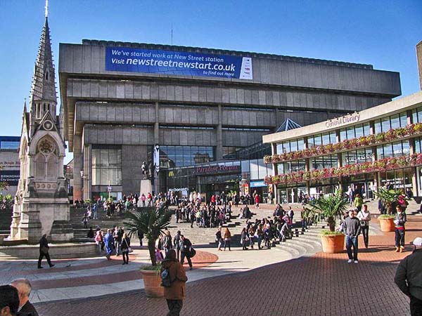
To put thing into context, let's take a look at the old Central Library, designed in 1974 by John Madin (who also designed BBC Pebble Mill, now demolished). Its Brutalist style led Prince Charles to state, famously, that it looks like "more like a place for burning books, than keeping them."
OK, so it's a bit scary. But by the 1990s the council had prettified it slightly, making it a bit more warm and friendly.
Inside, it's a mess of escalators & rectangular spaces but at least it feels like a place of learning; the fountain and arena outside are amazing in the summer.
New Library
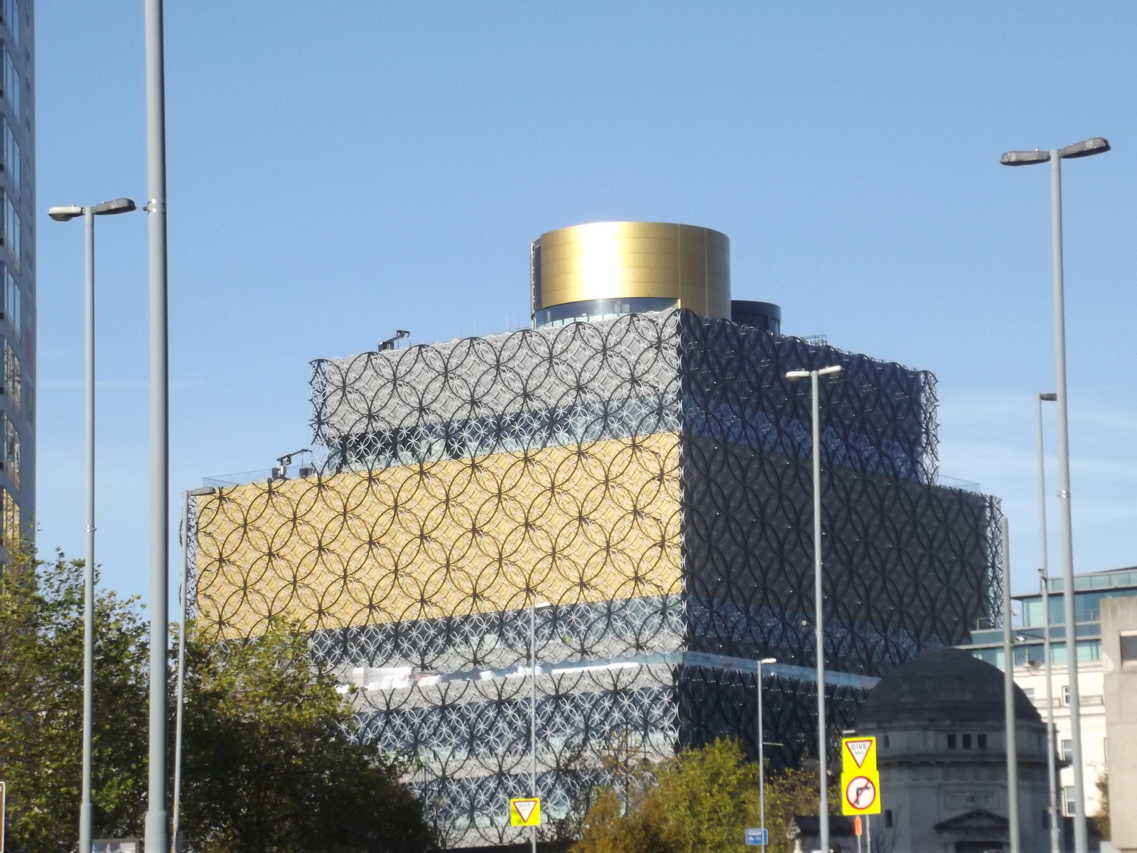
Now for the horror. If you have a sensitive stomach you may wish to turn away now.
That's it -- the gold thing to the right. My photo tames it slightly, but the image below gives a little clearer idea of just how jaw-droppingly gruesome the ironwork circles look close-up. (The architects are called Mecanoo, which is so close to Meccano that the whole thing sounds like a practical joke. Sadly not.)
Aside from being out-of-tone with all other buildings nearby, this Flickr photo demonstrates how the in-yer-face gold decoration would look far more suited to a multi-storey car park in the Middle East than a creative hub in a bustling, modern city.
So there you have it. The new Birmingham Library. The old one will be demolished, and this vile monstrosity will take over as the new place to burn books.
You may not agree with my opinions on this, but I just had to say something! Thank you for listening.
Conclusion
So what have I learned from this experience? Firstly, that art can be very different first-hand -- the photos above subdue the effect somewhat. Secondly, that even something as mundane as a rectangular building has the power to shock.
Attempting to get a more objective view as a designer, I did a bit more research online to find people's views on the new building. Of course, this is likely to be biased toward those who feel the wish to vent their spleen, but it is vitally important to be impersonal in order to evaluate the initial impact of the design.
A handful of comments on the Architects Journal website are all negative, with one mentioning potential pigeon problems (something I'd noted myself) and another asking how the underlying glass windows will be cleaned. The nature and location of the posts suggest that these are from people with good knowledge of architecture.
General public comments on SkyscraperCity XL (100 pages plus of discussion!) are mixed, and feedback on the Facebook page also contains both positive & negative views.
Looking around, a fair few people have questioned the need for a new library at all, given the general cuts in library services nationally and the cultural shift to electronic media. This is a good example of where public opinion is based on a misconception, because further research reveals that the library is predominantly an archive for books; the old library had temperature control problems, so the stock had to be shifted to a new, stable, environment otherwise it would rot away.
The new library has clearly polarised opinion, and it will be difficult to find any consensus with which to judge things objectively. Therefore, this needs to be evaluated from a perspective of greater insight into architecture & contextual architectural trends, and I simply don't have the background knowledge to do that.
So, in conclusion, I've been reminded of the need to stay objective as a designer; to avoid letting my own personal opinions cloud my professional judgement.


