Gaudi
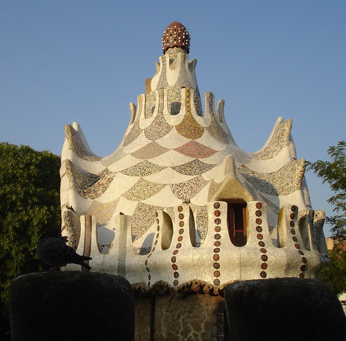
The Sky Arts documentary Gaudi's Barcelona was quite eye-opening. As I've stated before, I've always disliked his work but respected it at the same time.Within the programme the organic nature of Gaudi's designs shone through: emphasising irregularity, asymmetry, and natural form (trees, bones, etc.) and occasionally a "Dr Seuss" colour scheme. Not only the buildings but also the furniture within; the windows latches; everything. Hand-carved, unique.
This particular hand-carved, every-item-unique, styling reminded me of the seminal science fiction novel The Mote In God's Eye, which describes first contact with an alien race -- Moties -- who have evolved with an asymmetrical body.
Their fictional civilisation is extremely well-realised and carefully-thought-through, describing an approach to engineering which is similar to Gaudi's: each item they make is unique and suited to purpose. Additionally, they have a habit of quickly dismantling, recycling and scavenging materials when constructing new objects.
(This detailed approach to xenoanthropology is similar to the work done by fellow MA Games Design student Steph Brookes, who develops new animals based on the needs for them to survive in "real life".)
The natural form of his work is also evidenced within his Neo-Gothic and Art Nouveau inspired designs like the Sagrada Familia church. My immediate reaction when seeing this was to recall the insect-derived Geonosian architecture from Star Wars Episode II: Attack of the Clones. I suspect that the latter takes its cues from nature, influenced by Gaudi's work.
This outer appearance belies the clever structural mechanics which support his designs.
The documentary makes clear that Gaudi's highly indulgent designs are a result of extensive sponsorship by wealthy individuals who appreciated his art. This is, itself, interesting. My limited knowledge indicates that ground-breaking designers & artists usually struggle with the requirement to conform to commercial necessity, and that it is only financial support like this that allows truly visionary work to thrive -- risking failure as well as success (a good example being Stanley Kubrick).
Do I like Gaudi's work any better as a result of this documentary? No, I still dislike it. But I am now convinced more than ever that the man was a genius.
London Underground
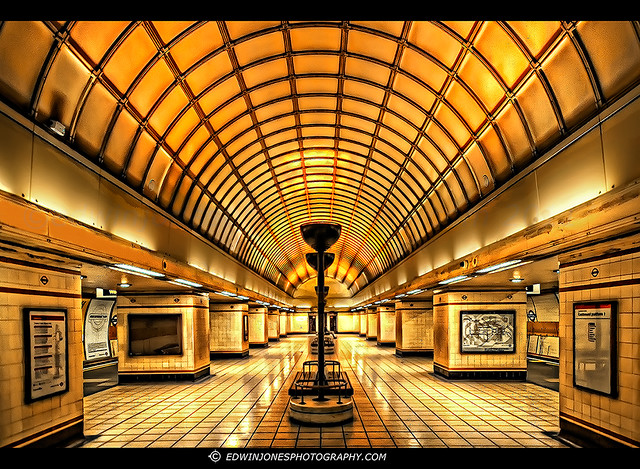
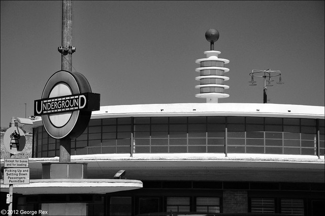
The BBC4 programme Art Deco Icons: London Transport (see clip here) examined the mass-branding of the London Underground system in the 1920s, from architecture to signage & typography.Its Art Deco styling stands in stark contrast to Gaudi's work: everything is regular, symmetrical and formal, emphasising the Machine Age.
This fascinating documentary examined everything from the underlying philosophy of the branding, overseen by Frank Pick (who acted somewhat like Gaudi's sponsors in making the whole grand scheme possible), all the way through to poster design and how it reflected the change in society and work patterns.
The beauty of the sleek designs -- the inhuman Kraftwerk-like Modernism -- really appeals to me, especially because it has a warmth rather than the coldness associated with industrialisation.
The juxtaposition of these two different approaches, separated by only about 20 years and sharing some historical common ancestry in places, highlights the way that a single philosophical goal (nature-inspired form, in Gaudi's case, and machine & geometry-inspired, for the Underground) can have a dramatic effect on a series of designs.
Within the Underground programme, one piece of background music jumped out at me: Steve Reich's Piano Phase. This minimalist piece involves two pianos playing the same sequence, slowly phasing out of sync with each other. The effect is to create a changing pattern of rhythms, which suited the images of ant-like commuters climbing on-and-off trains.
I had come across piece this in my teens, and the phasing idea resurfaced when creating music for an experimental recording (testing a digital studio set-up) that I made in the late 1980s under the band name Airport Convenience. Titled "Dinnertime", the voices are mostly students from Pembrokeshire -- with the exception of a heavily re-edited Richard Burton (an uncanny coincidence given my recent War of the Worlds post) and myself ("I can't take it no more").
Why post this self-indulgence on the blog? Well, in my particular role as a game designer I've taken on the mantle of being a one-man development team, and this has led me to start working on creating my own game music. And the last time I wrote any music in a serious manner was back at the time I recorded "Dinnertime". Funny how things come round like that.


