Following on from my examinations of background visual indicators of the 1970s and 1980s, this post attempts to find ways of suggesting a 1990s setting without using period iconography (e.g. Acid House smiley face).
The absence of iconography is important. It's too easy to make something appear to be 1980s by shoving a Rubik's Cube into the scene, or a Space Hopper for the 1970s. I want the environment to feel right before adding stuff like that into the scene. Hopefully, the cumulative effect will counter any adjustments made to items (where these items might otherwise infringe copyright or trademarks).
The 1990s has been a hard decade to pin down in this manner. However, with help from classmates, the first aspect to address was identified as the use of colour & patterns.
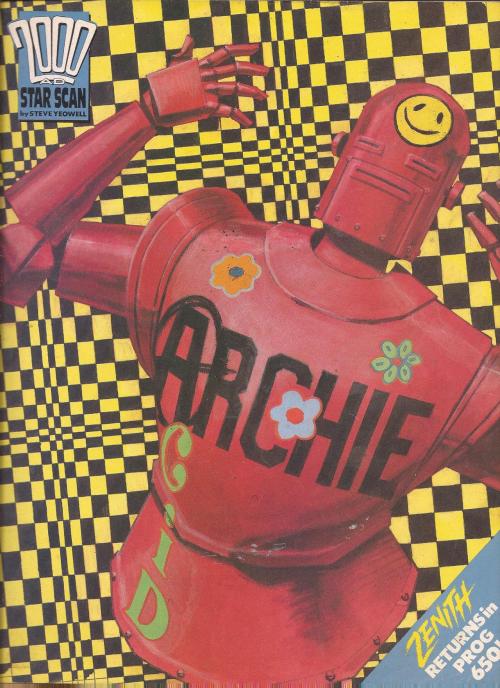
Dayglo and fluorescent colours were all the rage in fashion, mostly fuelled by the clubbing and rave subculture of the early '90s. Ultraviolet "black light" causes these colours to glow, and this effect helped create a "modern" spin on retro-1960s psychedelic stylings.
Patterns included animal (leopardskin spots, zebra stripes) and patchwork.
Another innovation of the period which leaked into fashion was fractal mathematics, which had surged in popularity during the late 1980s with advances in home computer technology & graphics. In line with the aforementioned 1960s retro affectation, Mandelbrot patterns became the new Paisley pattern equivalent.
The 1960s "vibe" was not only a cyclical fashion trend but also served as a symbolic link for rave drug culture, with fractals and dayglo colours fitting neatly into the psychotropic framework.
Room decor changed as well, but in a different way. Where the 1970s & 1980s had focused on particular colours, the 1990s was a bit of a free-for-all (before returning to 1970s browns in the first decade of the 2000s). Eclectic mixtures of pattern and colour became acceptable.
Of course, like the preceding 1980s, the whole decade did not follow a single trend. However, the highlighted visual indicators serve to drop the viewer into a time period quickly.
Monday, 22 July 2013
Sunday, 21 July 2013
Fizzy drinks
Nostalgia is a very tricky thing because it is so subjective. One person's memories are rarely another's, so one of the things I realised early in my research is that I need to concentrate on items which are likely to be ubiquitous in particular periods of recent (British) history.
Like sweets, fizzy drinks can take many of us back to a quixotic childhood. There are a number of triggers available here so I thought I'd examine a few aspects which can aid the creation of artefacts for games.
First is branding and advertising. Few of us who lived through the 1970s will have forgotten the "lip-smackin'-thirst-quenchin'" adverts for Pepsi.
Companies like Cresta ("It's frothy, man") Corona built up general brands; specific products like Barr's Tizer and Irn-Bru have also gained a prominence over the years. Strong advertising campaigns have left a similar legacy for non-fizzy drinks like Kia-Ora ("I'll be your dog") and Um Bongo ("they drink it in the Congo").
Then there's stuff on the periphery, like Soda Stream. It has never really gone away, but went into decline a couple of decades ago and an attempt at re-launch a quirky, high-end product in the early 2010s has not really caught on in the UK as much as in the rest of Europe.
The drink receptacles themselves are of great interest to me. In the mid-1980s fizzy drinks cans changed appearance, and it is increasingly difficult to find examples of older can designs.
First was the shape of the can: older cans looked more like baked bean tins, but the introduction of necking made the top and bottom of the can pull inwards to both strengthen the can and reduce metal usage.
Also introduced around the mid-1980s was the stay-push tab. This replaced the older ring-pull which was associated with litter and many a cut finger.
Ring-pulls are, in themselves, an iconic image of the 1970s, possibly because this decade represented the height of sales of the older style of can. Certainly a very useful item to add to the ambient period feel of a scene.
I've talked about the appeal of old-style Lucozade bottles before, with the orange cellophane wrap and medically dubious healing powers. Another iconic item to embed in a scene.
Finally the last thing I want to mention is the wide range of flavours available. Modern sales analysis techniques have left consumers with a pitiful range of products, and too many companies seeking to grab market share of existing big-selling flavours (e.g. my local Tesco stocks four different brands of Aero rip-off chocolate bars, all available in chocolate, orange or mint only).
The 1960s-1990s saw an explosion of obscure flavours -- strawberryade, pineappleade, limeade & lager, to name a few. So, not only can I offer old-style can designs & forgotten brands, but there are also fantastic nostalgic flavours to consider:
Fizzy drinks offer an easy way to set period and to trigger nostalgic affect, and they can form a natural set of objects to assist with gameplay (obstacles or platforms). I anticipate that they will be very useful in my project.
Like sweets, fizzy drinks can take many of us back to a quixotic childhood. There are a number of triggers available here so I thought I'd examine a few aspects which can aid the creation of artefacts for games.
First is branding and advertising. Few of us who lived through the 1970s will have forgotten the "lip-smackin'-thirst-quenchin'" adverts for Pepsi.
![]() |
| Full 1974 advert available on YouTube |
Then there's stuff on the periphery, like Soda Stream. It has never really gone away, but went into decline a couple of decades ago and an attempt at re-launch a quirky, high-end product in the early 2010s has not really caught on in the UK as much as in the rest of Europe.
The drink receptacles themselves are of great interest to me. In the mid-1980s fizzy drinks cans changed appearance, and it is increasingly difficult to find examples of older can designs.
First was the shape of the can: older cans looked more like baked bean tins, but the introduction of necking made the top and bottom of the can pull inwards to both strengthen the can and reduce metal usage.
Also introduced around the mid-1980s was the stay-push tab. This replaced the older ring-pull which was associated with litter and many a cut finger.
Ring-pulls are, in themselves, an iconic image of the 1970s, possibly because this decade represented the height of sales of the older style of can. Certainly a very useful item to add to the ambient period feel of a scene.
I've talked about the appeal of old-style Lucozade bottles before, with the orange cellophane wrap and medically dubious healing powers. Another iconic item to embed in a scene.
Finally the last thing I want to mention is the wide range of flavours available. Modern sales analysis techniques have left consumers with a pitiful range of products, and too many companies seeking to grab market share of existing big-selling flavours (e.g. my local Tesco stocks four different brands of Aero rip-off chocolate bars, all available in chocolate, orange or mint only).
The 1960s-1990s saw an explosion of obscure flavours -- strawberryade, pineappleade, limeade & lager, to name a few. So, not only can I offer old-style can designs & forgotten brands, but there are also fantastic nostalgic flavours to consider:
Fizzy drinks offer an easy way to set period and to trigger nostalgic affect, and they can form a natural set of objects to assist with gameplay (obstacles or platforms). I anticipate that they will be very useful in my project.
Saturday, 20 July 2013
Through The Years
A couple of months ago I'd started exploring the "look" of recent decades in an effort to find ways to enhance period aesthetics in my game designs.
Imagine my surprise when the following story fell into my lap:
It offers a unique opportunity to examine images taken in an identical context over a spread of four decades, which can be used to verify (or challenge) the period characteristics identified in my earlier posts. To start this process I re-arranged the original photos grouped by decade:
Let's start by looking at some 1970s images in more detail:
My "1970s Look" article postulated the following period details:
The photos were taken indoors, so no chance for sunshine. No wallpaper either, but the backgrounds for earlier photos appear to be school murals; 1980s onward use mottled muslin back cloths. A quick bit of research tells me that muslin use goes back to the early days of photography & cinema, but I don't personally recall seeing many school photos which used it until the 1980s. This could be useful for extra period decoration, if including portrait photos in a room -- the painted backgrounds definitely look more old-fashioned.
Next we'll examine some of the 1980s photos:
My "1980s Look" post postulated:
By the 1990s we're seeing more saturated colour (certainly for the background, which is also lighter) and a fashion change in the glasses which have shrunk a little.
Finally, the 2000s brings another increase in sharpness of images (notice the resolution of the shirt pattern) and even more vivid & crisp colour. Another noticeable change is more balanced lighting, including some accenting.
Well, Mr Irby -- thank you very much for a small joke that, 40 years later, became a minor worldwide news story. It has proven useful in many more ways that you could have ever anticipated, and has assisted in the process of applying nostalgia within video game design...
Imagine my surprise when the following story fell into my lap:
Texas Teacher Dale Irby Wears Same Outfit For 40 Years In DallasThe story originated in the Dallas Morning News and spread virally through news outlets worldwide. (Indeed, the fast spread of the images became a news item in itself.)
Huffington Post, 3 July 2013
A fun-loving teacher has become an internet sensation after school photos of him wearing the same tank top and shirt for 40 years went viral.
Dale Irby, 63, accidentally wore the same brown v-necked tank top and big-collared disco shirt in two consecutive school photos from 1973. When he realised what he had done, the embarrassed teacher's wife Cathy dared him to repeat it for a third year.The PE teacher managed to keep up the joke and for the past 40 years staff and pupils have eagerly awaited Mr Irby's arrival at school for the annual photo.
Let's start by looking at some 1970s images in more detail:
My "1970s Look" article postulated the following period details:
- Faded colour, with lots of brown & beige
- Sunshine and lens flares
- Patterned wallpaper
The photos were taken indoors, so no chance for sunshine. No wallpaper either, but the backgrounds for earlier photos appear to be school murals; 1980s onward use mottled muslin back cloths. A quick bit of research tells me that muslin use goes back to the early days of photography & cinema, but I don't personally recall seeing many school photos which used it until the 1980s. This could be useful for extra period decoration, if including portrait photos in a room -- the painted backgrounds definitely look more old-fashioned.
Next we'll examine some of the 1980s photos:
My "1980s Look" post postulated:
- Lots of black / night-time, with under-saturated (but not quite faded) primary colours.
- Stripes
- Glow
By the 1990s we're seeing more saturated colour (certainly for the background, which is also lighter) and a fashion change in the glasses which have shrunk a little.
Finally, the 2000s brings another increase in sharpness of images (notice the resolution of the shirt pattern) and even more vivid & crisp colour. Another noticeable change is more balanced lighting, including some accenting.
Well, Mr Irby -- thank you very much for a small joke that, 40 years later, became a minor worldwide news story. It has proven useful in many more ways that you could have ever anticipated, and has assisted in the process of applying nostalgia within video game design...
Friday, 24 May 2013
Status Report
Blimey! It's been a few weeks since my last post. As usual, full-time work has taken up most of my time (mostly marking student work). Development for my MA -- which had been proceeding at a snail's pace since March anyway -- had pretty much ground to a halt.
However, last week the third MA course module concluded with a review of what had gone before, and laid out plans for the next six months. This gave a good opportunity to kick-start things again, so I thought it would be a good idea to give a status report to set the scene for future posts.
I've drawn up a list of 23 tasks that need to be carried out for Practice 2 and scheduled them using a Gantt chart. In an unusual move, the scale on the chart is relative -- using 'cumulative hours' rather than dates -- because I've discovered (the hard way) during the last 9 months that project work and full-employment work do not play well together.
However, last week the third MA course module concluded with a review of what had gone before, and laid out plans for the next six months. This gave a good opportunity to kick-start things again, so I thought it would be a good idea to give a status report to set the scene for future posts.
I've drawn up a list of 23 tasks that need to be carried out for Practice 2 and scheduled them using a Gantt chart. In an unusual move, the scale on the chart is relative -- using 'cumulative hours' rather than dates -- because I've discovered (the hard way) during the last 9 months that project work and full-employment work do not play well together.
Wednesday, 1 May 2013
Applied Nostalgia: That 1980s Look
In my previous post I looked at how to achieve a 1970s mood visually. This time I'm looking at the 1980s.
The first thing to note is that I'm deliberately avoiding iconography -- so no Rubik's Cubes, New Romantic pop posters or asymmetric hairstyles. Instead I'm trying to suggest the period by use of colour, decoration and lighting; to provide a context for other items.
I'll start by looking at others who have tried to conjure that period visually in pastiche. (This gives a quick route to identifying the common signifiers, and saves re-inventing the wheel).
First up is the 2008 TV series Ashes to Ashes, in which detective Alexandra Drake was transported back through time into a stylised world of policing based on shows like The Gentle Touch, The Professionals and Dempsey & Makepeace.
Next is the cult phenomenon Garth Merenghi's Darkplace. This series captures many of the stylings associated with cheap VHS horror movies.
This even continues to the DVD cover which does a cracking job of capturing the "airbrushed glow" look of posters from this era.
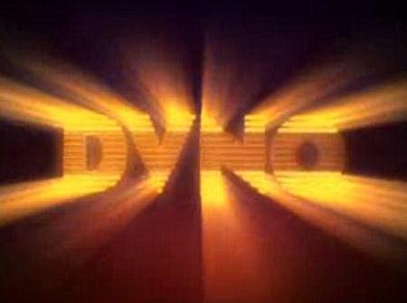
Talking of VHS (and on a general graphic design theme) next on my list is Justice's DVNO music video (2007), produced by the Machine Molle animation & VFX company. This video takes song lyrics turned into the kind of animated logos associated with companies like HBO, CBS Fox and Cannon Films during the 1980s.
To achieve a 1980s look, a number of factors need to be included:
There were quite a few movies & TV shows in the 1970s with night-time scenes, but this seemed to become the prevalent look in the early 1980s.
Here's a couple of examples of this in action:
The image below is from the 2005 Doctor Who episode Father's Day, which portrayed a wedding in the late 1980s. Although the general filming style of the episode fails to capture that period look, the make-up, hair and clothes do a good job of following the pastel colour scheme associated with the latter half of the decade.
The image below shows a number of elements in combination: red-and-black striped leotard (note the muted red); and black leg-warmers and footless tights.
This also extended to lighting: with the emphasis on darkness, scenes are often lit by light coming through blinds or bars.
Cartoons like He-Man and the Masters of the Universe featured incandescent elements as a matter of course, and most logos were not complete without an edge glow.
The first thing to note is that I'm deliberately avoiding iconography -- so no Rubik's Cubes, New Romantic pop posters or asymmetric hairstyles. Instead I'm trying to suggest the period by use of colour, decoration and lighting; to provide a context for other items.
I'll start by looking at others who have tried to conjure that period visually in pastiche. (This gives a quick route to identifying the common signifiers, and saves re-inventing the wheel).
First up is the 2008 TV series Ashes to Ashes, in which detective Alexandra Drake was transported back through time into a stylised world of policing based on shows like The Gentle Touch, The Professionals and Dempsey & Makepeace.
![]() |
| See the programme intro here. |
![]() |
| Clip here. |
Talking of VHS (and on a general graphic design theme) next on my list is Justice's DVNO music video (2007), produced by the Machine Molle animation & VFX company. This video takes song lyrics turned into the kind of animated logos associated with companies like HBO, CBS Fox and Cannon Films during the 1980s.
Analysis
To achieve a 1980s look, a number of factors need to be included:
| Signifier: | Black |
|---|---|
| Why? | In the 1980s, black was the new brown. Film & video from this period is generally better preserved than 1970s stock, so the blacks are also a lot darker. There is heavy use of darkness and night-time as background (as opposed to the sunny look of the 70s). |
There were quite a few movies & TV shows in the 1970s with night-time scenes, but this seemed to become the prevalent look in the early 1980s.
![]() |
| Night-time scenes became more common in the 1980s, as demonstrated in this still from Joe Jackson's Steppin' Out music video |
| Signifier: | 80-85: Undersaturated colours (especially reds & blues); gold; black & white in contrast; 85-90: Pastel shades, overlit. |
|---|---|
| Why? | The 1980s palette is much wider than the previous decade; although primary colours are evident they are not vivid. This may be due to degradation of video tape (on which many programmes were shot, to save money). |
Here's a couple of examples of this in action:
![]() |
| Gary Numan, performing his Telekon album live. Note the muted red in contrast to the black. |
![]() |
| Larry Blackmon from the band Cameo in 1986, with trademark red codpiece. Note the pastel shades (behind) starting to come in. |
| Signifier: | Stripes! Stripes! Stripes! |
|---|---|
| Why? | In clothing, coloured stripes were fashionable, usually in contrast to black or white. |
The image below shows a number of elements in combination: red-and-black striped leotard (note the muted red); and black leg-warmers and footless tights.
This also extended to lighting: with the emphasis on darkness, scenes are often lit by light coming through blinds or bars.
![]() |
| The "lit through blinds" technique just screams '80s in this scene from Blade Runner. |
| Signifier: | Glow |
|---|---|
| Why? | Although airbrushed artwork had been around during the 1970s, the effect started to move into video work in the following decade. Cartoons like He-Man and the Masters of the Universe featured glowing magic |
Cartoons like He-Man and the Masters of the Universe featured incandescent elements as a matter of course, and most logos were not complete without an edge glow.
Next time we'll be looking at the difficult-to-pin-down 1990s.
Subscribe to:
Posts (Atom)