
In part 2 I'm going to look at the aesthetics of the game. It's apparent that a lot of thought (and hard work) has gone into the look & sound, and I'd like to investigate this before moving onto the mechanics.
Audio
As you'd expect, the game features appropriate event sounds (e.g. the xylophone, or the clashing of swords when the knight moves).
One major audio feature is the Michael Nyman-esque piano soundtrack, which runs continuously in the background. Cam Goold has done an impressive job technically -- InsideSocialGames describes the piano work as "high quality" and "haunting" -- but in my personal opinion I'm not totally convinced that the music suits the mood of the game. (Mind you, if I'd been on the team I'd probably have pushed for an oom-pah band soundtrack instead, which would've probably lost them the BAFTA).
Appearance
On the initial levels the RYB primary/secondary colour scheme certainly reinforces the whole 'toys' theme. The target audience is mainstream with "a wide age range", so I'd imagine that this colour choice also helps with making the game appeal to young children.

The cartoony graphics also reinforce the 'anthropomorphic toys' theme. (A photorealistic appearance would have been at odds with the fantasy nature of the mechanic, and would also introduce problems with scale.) Indeed, I wonder if the designers had possibly considered toon shading at some point (Kristian had done some lovely cel-shaded rigged 3D models in Maya when he was an undergraduate). Mind you, the 'cost' (in processing terms) of this is probably too much for the iPad.
I know that the team fiddled with the camera angle early on, and this is something is something which I find fascinating. I've surmised that the team started with a direct overhead view (see below) but realised that it obscured the appearance of characters & objects too much. It's conjecture on my part, but I suspect I'm not far off the truth.
 |
| Overhead view at the end of Week 1 of development |
 |
| This viewing angle shows more of the object in 3D and also allows the top wall to house controls. |
A similar issue plagued my own Eggles game design. I'd be interested to see what difference it would make to Tick Tock Toys if this game had a 2D aerial view only, with graphics optimised for 2D (i.e. symbolic rather than realistic 3D shape).
Environment, characters & objects
Let's start with the first toybox. Official screenshots (like the one below) show it as garish purple, but it's less saturated in the actual game on the iPad. Perhaps this relates to the iPad's screen? The purple provides a good contrast for the robot's yellow body, anyway. I can't remember seeing many wooden boxes with vertical panelling at the sides, so I'm guessing that the stripes serve to emphasise the perspective.

The robot (Tic Toc) has the standard characteristics of a 1940s toy robot: square head & body parts, clockwork key, front chest controls, and side-to-side wobble when walking. He also sports an antenna, a common feature of 1950s science fiction robots.
 |
| The first tin toy robot was the yellow Lilliput robot (left) made in Japan. I'm guessing from the colour & ears that this was an (indirect?) influence on Tic Toc. An iconic design, it's still available today as a replica for collectors. Nostalgia in action! |
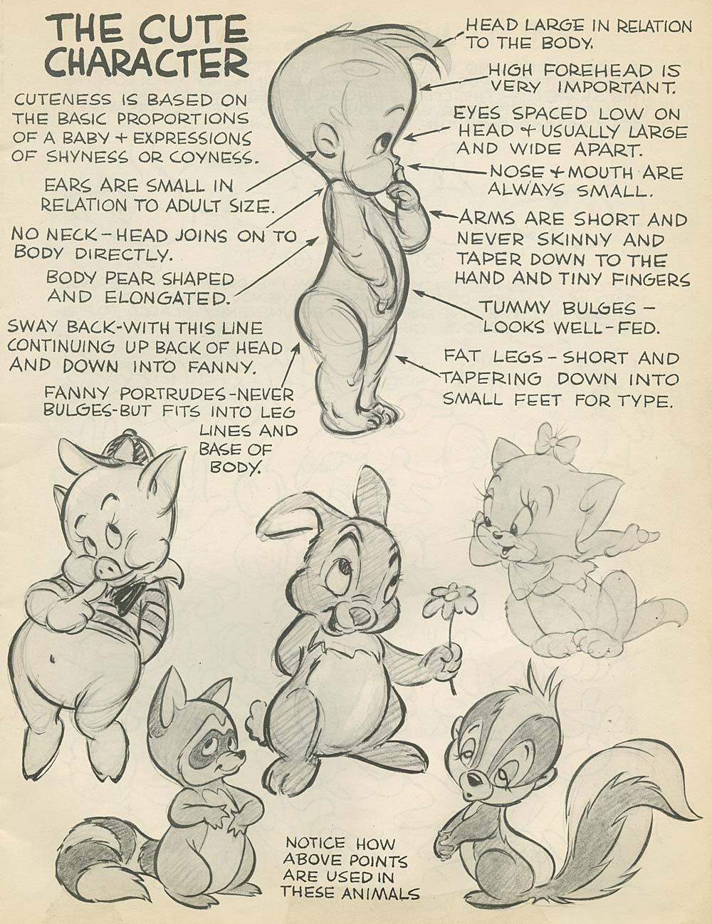
The squat appearance, large forehead / low eyes (and ears) and walking posture (arms leading) give him the appearance of a child -- you can see similar characteristics in the work of legendary animator Preston Blair -- and the flexible arms give greater room for characterisation in movement. The rounded corners add a 'soft' feel, creating an extremely endearing character who really comes alive in cut-scenes.
Notice the key in his back. This is something that I'll talk about in the mechanics section, but it's proportioned nicely and is easily recognisable as a clockwork key.
When I first played the game, one thing that really jarred was the frogs. I'd not come across press-to-unroll-tongue frog toys before, but it's immediately apparent that the ones in the game look far less like toys and a bit too much like real frogs. They also have a bit of a tin lithography appearance -- possibly to fit in with the tin robot?

The other characters (rag doll, bear, rubber duck) are all lovingly created to keep the 'cute' factor going. Objects (building blocks, ABC blocks, wooden trains) are a little more realistic in appearance.

Animation
Aside from the character rigging and controlled movement, there are some bonus animations which add significantly to the game.
My personal favourite is seen at the start of each room. The robot's appearance is accompanied by an expanding ring of light, which half-illuminates the room; this is followed by a similar ring which fully illuminates the room. Both serve to focus the player's eyes on the start and end points, and this trick ensures that the player can't fail to understand their goal.
The celebrations act as a nice reward for the player, and the cutest one is the end-of-room mini-celebration when Tic Toc reaches the frisbee: a dance, with confetti falling from the sky (just on Tic Toc in early rooms, but into the whole room at the end of a level). The end-of-level celebration cut-scene gives a break from the box view and lets us see the characters in their full glory.
I could spend ages analysing the aesthetics in even more detail but I feel I've got the general feel of things covered. Next post we're onto the game mechanics...