
 I'm a bumbling amateur when it comes to Industrial Design, but one thing I do know is that chairs feature heavily in Contextual Studies.
The first one, by Serge Chermayeff, is a nice Modernist piece. At first I thought 'oh yeah', but looking back on it I'm starting to find a lot more in it. I love the way he uses the empty sides, which could have been solid panels, to create something that feels more 1970s than 1930s.

 Finally there's a glass bubble chair which looks horrendously
dysfunctional. I was going to leave it out, but after reading about the
construction method (hand-blown thick glass, which must be very
difficult at this size) I became more interested.
Finally there's a glass bubble chair which looks horrendously
dysfunctional. I was going to leave it out, but after reading about the
construction method (hand-blown thick glass, which must be very
difficult at this size) I became more interested.
At this stage I really wanted to get back to something which had excited me since I entered the building: the floor. Or, to be more precise, the GLASS floor. The main section has embedded glass bricks. The stairs are solid planks of semi-opaque glass. Even the ceiling lights follow the theme. Best of all, though, is the bridge across the atrium: it looks just too thin for a bridge.


This meandering took me away from the Postgrad Posse tour group, which turned out to be a big mistake! I got sidetracked into the next floor and found that they'd moved on without me. (Took two hours to catch up with the main party in another part of town.) Thankfully, I got a great deal out of the rest of the gallery.
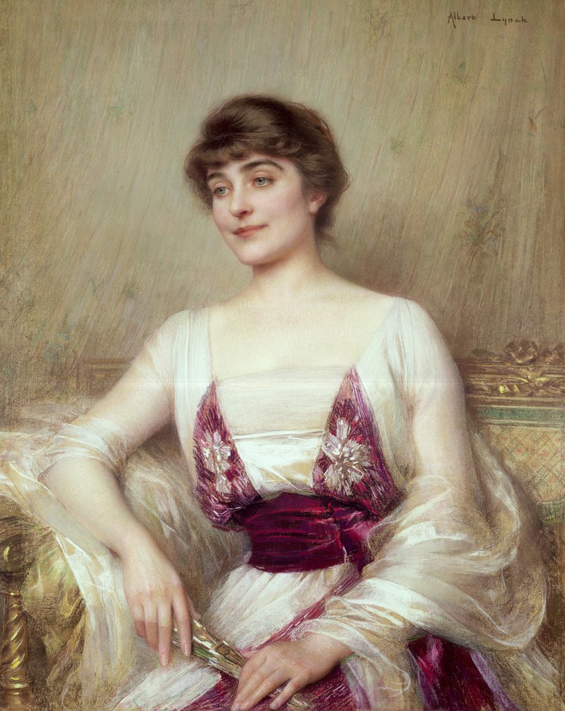
 There were some gorgeous Victorian paintings. I liked this set which captured a foggy world. Very atmospheric. (In a moment of creative whim I tried altering this photo to paint out the left-side figure, to balance the image. I got the textures but it was a pain trying to match lighting colours, and I gave up in the end. A shame, because I think this makes a nice photo otherwise.)
 Winter Fuel really stood out from the paintings around it, due to the vibrant colour (which is lost a little on this photo, although a quick search on Google Images reveals that I'm not the only one to fail to capture this aspect).
 The majority of the exhibits were unexciting, but were very well presented. A lot of places try to avoid competing with the paintings, but it's nice to see a gallery where the surroundings are as interesting as the exhibits.
His style reminds me a bit of Reynold Brown, the famous American film artist who, coincidentally, did the poster for the Charlton Heston version of Ben Hur. (Von Wagner's painting was allegedly based on the original book.) If you've never seen Brown's work I recommend seeking it out -- you can almost feel the characters move.
I first fell in love with this dynamic approach when reading a newspaper article which featured Before the Parachute Opens by Tullio Crali from 1939. I'm still amazed by the feeling that you're about to fall that distance. (Crali's work is a whole different kind of Futurism, away from the typography and exclamation marks.)

I first fell in love with this dynamic approach when reading a newspaper article which featured Before the Parachute Opens by Tullio Crali from 1939. I'm still amazed by the feeling that you're about to fall that distance. (Crali's work is a whole different kind of Futurism, away from the typography and exclamation marks.)


A quick trawl on the web turned up another of his paintings, Elegante, which could have been painted yesterday. Quite remarkable.


As mentioned before, I'm quite a fan of dynamism in images. I'm also a sucker for 3D, and especially 2D images which appear 3D. This next work (by Kelley Walker, I think) was jaw-dropping. A flat image, from any viewing angle the rolled-up paper appeared to leap from the canvas. I'd go again just to see this on its own. Fantastic.

 Final item from the gallery is this (which is definitely Kelley Walker) copy of The Sun from the early 1980s, left open at the page "I'd shoot my son if he had AIDS, says vicar!"
It really sums up the tabloid journalism of the era well, and works nicely as a snapshot of life.
Overall, this was a good bit of exploration. At the time only a few items stood out, but the restrospective act of posting them up has really added a lot to the experience.
Quick moan about poor design
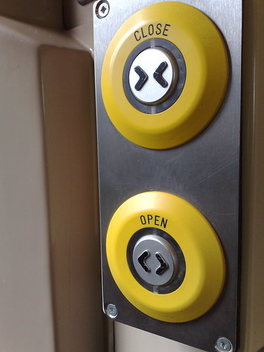
Why did this annoy me? Well, for a start, the doors are normally closed. The main time that somebody would press a button is to open them; they shut automatically when the train starts, so the 'close' button is rarely needed (except, perhaps on cold or windy days).
My understanding of ergonomics (presuming a reading-order movement of the eye downwards from head height) suggests that the top button would be the first thing you see -- especially when in a hurry, as some traincatchers can be -- and would be the default choice when looking for a button to open the door.
The train manufacturer's poor logic was borne out by the number of people who had trouble trying to open the doors. No matter what else was right with the train carriage, this will be the thing that sticks in a passenger's mind. Just goes to show that it's important to get the details right.