Monday, 8 October 2012

Skylanders, the Wooden Mirror & 3D printers


Skylanders


Last week I was having a discussion with a fellow student about storage of personal video game data, and we wandered into talking about distributed RFID-based storage system on Skylanders and the crossover between virtual games and real-life toys & games (i.e. collectibles in this case).

A few days later I found myself reading an article on Digital Spy about the development of Skylanders.  It really rammed home just how much work had gone into the process.  Not a surprise, given the investment required to create the specialist hardware, but the most interesting part was this quote:
"We would design these toys, and one of the ways we knew things were working was - every time we made them, they would vanish," continued [Paul] Reiche. "We would do demos in Santa Monica but we never went home with the toys, because someone would always take them. We said, 'Okay, this is a good sign'."
So it was obvious -- even at an early stage -- that these items had a charm.  (You can sit there with a focus group all day, but people stealing your stuff is a pretty sure sign that they like it.  Either that, or your stuff is way too expensive.)
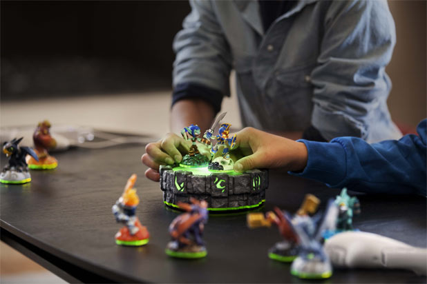

I remember dismissing the game when I first saw it on a kids' TV show, thinking it was yet another lame peripheral sales gimmick.  However, I've now caught up with the rest of the world and realise that this is definitely something I need to look at in more detail...

Wooden Mirror


On a separate note (or at least what I thought was a separate note) I was showing a work colleague some items from the Manchester trip earlier today.  I mentioned how my game design antenna was piqued by the intrinsic charm of Bruce Aitken's wooden clocks, which wouldn't be half as endearing if they were made of metal or plastic.

My colleague then introduced me to a piece of art I'd never seen before: Daniel Rozin's Wooden MirrorThis video shows what it's about:


It's a very nice idea: wooden blocks angled by a solenoid to reflect different levels of light to create a grey-level pixel; the pixels can then be driven live from a video camera.  Very simple and yet very high-tech at the same time.  Best of all, it has the magic charm.  By contrast it's not the wood making the charm work, it's the novelty and mechanical quality.

This got me thinking: can this kind of thing work inside a video game?  I doubt it.  We're used to game worlds realising the fantastic, but we're not used to seeing it in real life.  It's the real-life novelty that's a major part of the charm.


Joining the dots with 3D printing


And real-life novelty is why there's such about low-cost 3D printers at the moment.

Joining the dots, how would 3D printing enhance a game like Skylanders?  Imagine the ability to print (and customise!) your physical game character.  (Obviously, you'd need an Internet-connected central storage system instead of RFID.)  That literally adds a whole new dimension to the experience, though, and a lot of excitement.

If you could 3D print a wooden mirror at home, it would probably have just as much charm as the original.  (Albeit a wooden mirror made of plastic ... with extra solenoids & control circuitry, which you can't print.)  It certainly lifts things beyond the anything-can -happen artificial on-screen world.

I noticed today that Disney were suggesting creating toys which could be printed.  This came up in a 3D modelling lesson with my Foundation Degree students today, and we discussed the idea that people would download toys or hoover parts, like they download MP3 or ebooks.

It's a whole new world, and the phenomenal success of Skylanders suggests that video games will inevitably break the real-world barrier.

(Updated 20 Oct 2013 -- added fallback link for embedded video)

Spinningfields Craft Fair

I'm normally dismissive of things like hand-made jewellery, crocheted birthday cards or wooden stencils.  Like ice skating or sword-swallowing, it's definitely not my kind of thing -- but I have no objection to other people enjoying it.

So why did I find myself at a the Great Northern Contemporary Craft Fair?  Well, it was the final stage of the Manchester trip and I decided to go in with an open mind.
The result?  Well, I was polarised.  Most of my prejudices were reinforced, walking past stall-after-stall of expensive artisan works.  Certain that every item took time & care to craft, I was harshly reminded that creative works can't please all of the people, all of the time.

However, a few items really stood out as something very special.  The first item to catch my eye was Holly Levell's "soft sculptures" of household food & drink.  The carefully sewn-together Monster Munch packets are really quite a delight to the soul, and show how you can take a charming new slant on something everyday.


This is something relevant to my Games Design work, as the notion of charm is a topic which will be explored as part of my research.

Next up is a visual spectacle: Jin Eui Kim has created a 3D ceramic form which uses "tonal bands" to accentuate ridged circles in these, well, erm ... not quite sure what they are, but I know I like them.


I'm sure there's some clever application of texture and displacement mapping for 3D modelling to be extracted from this work, but these are just so gosh darned captivating to look at that I'm going to leave that for another time.

Bruce Aitken's wooden clocks are quite special.  They are a lot more fragile-looking than they appear in the photo, mainly because the cogs are not solid -- there are all kind of gaps in places, which give the feeling that something will snap off.  This is accentuated by thin arms which are part of the latching mechanisms.

Again, making the cogs -- and the entire clock -- out of thin wood adds charm to them.
My last item is something I spotted outside the craft fair: the window display at the All Saints clothes store.  The window is stacked with anique sewing machines in an extremely attractive pattern.  Each is different, adding a detail which says something about the difficulty in putting this display together.  Quite special.
 

So, in conclusion, what have I learned from the experience?  Firstly, I've been reminded that when you aim for a target audience you're also likley to alienate other audiences.  Secondly, I've seen a number of things that will defeinitely help me to evaluate the meaning of 'charm' in design.

(Revised 20 Oct 2013 -- dead links updated)
Sunday, 7 October 2012

Manchester Art Gallery

While I was at the Manchester Art Gallery I thought I'd take a look at some of the other rooms and floors.

I'm a bumbling amateur when it comes to Industrial Design, but one thing I do know is that chairs feature heavily in Contextual Studies.

The first one, by Serge Chermayeff, is a nice Modernist piece.  At first I thought 'oh yeah', but looking back on it I'm starting to find a lot more in it.  I love the way he uses the empty sides, which could have been solid panels, to create something that feels more 1970s than 1930s.

Second is the metal chair Slice which looks both hard & cold and yet organic at the same time.  At an initial glance the ridged seating panel would be best described as 'kinky', but it's clear that it would offer a lot more comfort than a flat metal surface.  This has definintely grown on me since the trip.

Finally there's a glass bubble chair which looks horrendously dysfunctional.  I was going to leave it out, but after reading about the construction method (hand-blown thick glass, which must be very difficult at this size) I became more interested.

The next piece was sat among a collection of less-than-inspiring chandeliers.  The exploding crockery & cutlery really stand out at an initial glance, and gets better the more you look at it.


At this stage I really wanted to get back to something which had excited me since I entered the building: the floor.  Or, to be more precise, the GLASS floor.  The main section has embedded glass bricks.  The stairs are solid planks of semi-opaque glass.  Even the ceiling lights follow the theme.  Best of all, though, is the bridge across the atrium: it looks just too thin for a bridge.


This meandering took me away from the Postgrad Posse tour group, which turned out to be a big mistake!  I got sidetracked into the next floor and found that they'd moved on without me.  (Took two hours to catch up with the main party in another part of town.)  Thankfully, I got a great deal out of the rest of the gallery.

There were some gorgeous Victorian paintings.  I liked this set which captured a foggy world.  Very atmospheric.  (In a moment of creative whim I tried altering this photo to paint out the left-side figure, to balance the image.  I got the textures but it was a pain trying to match lighting colours, and I gave up in the end.  A shame, because I think this makes a nice photo otherwise.)

Winter Fuel really stood out from the paintings around it, due to the vibrant colour (which is lost a little on this photo, although a quick search on Google Images reveals that I'm not the only one to fail to capture this aspect).

The majority of the exhibits were unexciting, but were very well presented.  A lot of places try to avoid competing with the paintings, but it's nice to see a gallery where the surroundings are as interesting as the exhibits.


The next painting blew me away: The Chariot Race by Alexander von Wagner.  What dynamics!  As a big comics fan I've long been fascinated by movement within an image.  It's easy to take a snapshot of an action, but capturing that kinetic is a rare talent.  (This is helped by the gallery's lighting, which really enhances the colour.)


His style reminds me a bit of Reynold Brown, the famous American film artist who, coincidentally, did the poster for the Charlton Heston version of Ben Hur.  (Von Wagner's painting was allegedly based on the original book.)  If you've never seen Brown's work I recommend seeking it out -- you can almost feel the characters move.


I first fell in love with this dynamic approach when reading a newspaper article which featured Before the Parachute Opens by Tullio Crali from 1939.  I'm still amazed by the feeling that you're about to fall that distance.  (Crali's work is a whole different kind of Futurism, away from the typography and exclamation marks.)


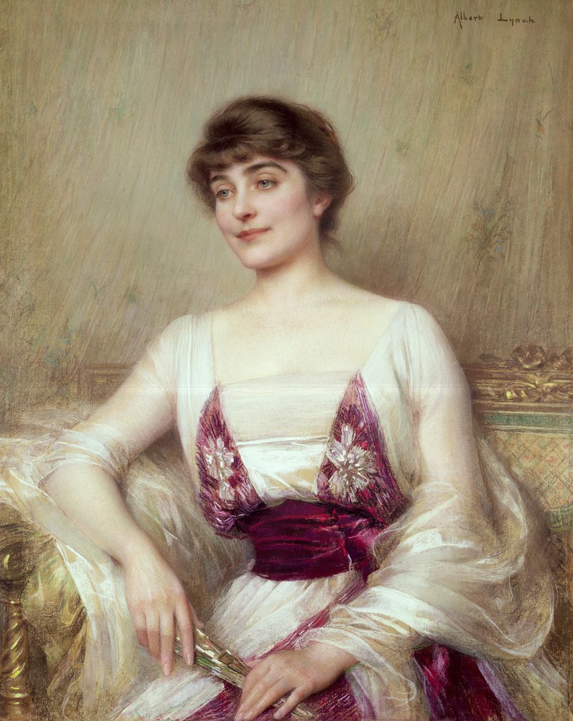
Head of a Girl by Albert Lynch is a surprisingly modern-looking image, and caught my eye due to its anachronistic appearance in the midst of older-looking portraits.

A quick trawl on the web turned up another of his paintings, Elegante, which could have been painted yesterday.  Quite remarkable.
The tiny moulded plaster panels below are based on classical sculptures.  It's not the detail but the size which impressed me.


This dress should have been part of the First Cut exhibition but was down on a lower floor along with other works on colonialism.  Making clothes from maps seems to be a common idea for artists, but I thought this worth including.

As mentioned before, I'm quite a fan of dynamism in images.  I'm also a sucker for 3D, and especially 2D images which appear 3D.  This next work (by Kelley Walker, I think) was jaw-dropping.  A flat image, from any viewing angle the rolled-up paper appeared to leap from the canvas.  I'd go again just to see this on its own.  Fantastic.


Final item from the gallery is this (which is definitely Kelley Walker) copy of The Sun from the early 1980s, left open at the page "I'd shoot my son if he had AIDS, says vicar!"

It really sums up the tabloid journalism of the era well, and works nicely as a snapshot of life.

Overall, this was a good bit of exploration.  At the time only a few items stood out, but the restrospective act of posting them up has really added a lot to the experience.


Quick moan about poor design


On the train back home from Manchester I spotted some poor design which really irritated me.  The passenger doors are operated by push-buttons, which are arranged as 'close' (top) & 'open' (bottom).

Why did this annoy me?  Well, for a start, the doors are normally closed.  The main time that somebody would press a button is to open them; they shut automatically when the train starts, so the 'close' button is rarely needed (except, perhaps on cold or windy days).

My understanding of ergonomics (presuming a reading-order movement of the eye downwards from head height) suggests that the top button would be the first thing you see -- especially when in a hurry, as some traincatchers can be -- and would be the default choice when looking for a button to open the door.

The train manufacturer's poor logic was borne out by the number of people who had trouble trying to open the doors.  No matter what else was right with the train carriage, this will be the thing that sticks in a passenger's mind.  Just goes to show that it's important to get the details right.

Saturday, 6 October 2012

Manchester First Cut exhibition

The First Cut exhibition at Manchester Art Gallery features a range of paper-based art.  With this style of work it's usually the technically intricate stuff which grabs me, and that was certainly the case here.  Overall, there wasn't much to inspire -- or so it first appeared...

I had intended to post a very brief summary with photos.  However, when I started to sort through the images I found myself drawn into the work more deeply, and started to look at the artists' websites for more background.  What I found added a lot more depth, and I've ended up deciding to post pretty much everything I photographed.

Definitely shows the importance of reflective practice!

This stunning piece is by Chris Andrew Jones who produces decayed-looking images using magazines and varnish.  I found images of a similar bike (prototype?) and a jaw-dropping horse-and-cart on his website.

Next up we have a couple of exhibits which caught my eye: a flower bed made of small pop-up gardening books, a forest of paper leaves, and a smoke-like column.


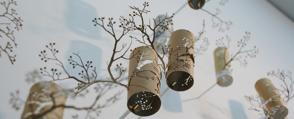
Yuken Tetuya's miniature, detailed tree is cut from a Burger King paper bag.  It's part of a series where he takes a bag produced by a large multinational and cuts a tree into it, one indigenous to the country in which the company is based.  The effect is of fantastic fragility, which comes across better in a professional photo of this same work.  His website shows other projects, including a very imaginative toilet roll installation.

This next one by Su Blackwell is a bit boring but I've included it to allow me to link to some of her other work, which is stunning.  My particular favourites are Edensor, Hope and Jorinde & Jorindel.
Noriko Ambe's A Piece of Flat Globe Vol. 8 is an example of how real life overtakes art.  Since 1999 she has obviously spent a lot of time making this type of erosion sculpture -- her website confirms "I individually cut single sheets of paper by free-hand and stack them together" to "embody relationships among humans, time and nature."

Yet paper-erosion 3D printers use this same technique to create 3D models.  Perhaps the tedious, labourious construction is part of her message?  If not, she's thrown away a lot of time she'll never get back!

Unfortunately I couldn't get a close-up of this next exhibit, so it's badly out-of-focus in my photo.  You'll find better images of The Judge and Inheritance online, although they lack the three-dimensionality of the real thing.

These weapons, plus Money Map of the World, are by Justine Smith, who specialises in the concept of money as a conduit of power.

I loved this this large-matchbox-sized explosion of type & camera-related images.  Being utterly useless at German, I had to look up 'fotoecken' and found it to be the small corners used to mount photos.

It reminded me of Futurist stuff, so I popped onto Google to look up Futurism to add a text link; by luck I'd forgotten to delete the previous search text and ended up looking at 'fotoecken futurist' -- the first result of which was the personal blog of exhibit artist Sarah Bridgland!  Maybe there just aren't enough people creating dynamic art with photo-corners.

These final two images are typical of much of the work on display: lots of sliced book pages, and faar too many silhouettes.  Once you've seen too many examples of the same idea, it's easy to start skimming over things -- so I picked these to remind me that each piece has been created for a reason, and that it would get a lot more attention if it were in contrast or isolation.


More Manchester art in the next post!

Thursday, 4 October 2012

Balancing study & work

Blimey, what a week. Paid work has really got in the way of academic study this last 5 days -- one of the downsides of being a part-time student.

However, the good news is that I hit the university library on Saturday and took out a number of useful-looking books:
  • "A Theory of Fun for Games Design" by Raph Koster
    This really caught my attention in a big way.  Throughout my scattergun research, 'the experience' is coming up again-and-again as a key factor, requiring a balance of game elements. I'm eager to sample Koster's opinion on the matter, which I think is likely to provide lots of food for thought.
  • "Games Design Perspectives" edited by François Dominic Laramée
    You can't really argue with the experience of 25+ different game designers, and it'll certainly be interesting to see what they have to say on the whole experience/elements theme.
  • "Games Design Theory & Practice" by Richard Rouse
    A bit general, but I'm hoping this will either reinforce existing themes or challenge them.  I'm a bit too reliant on Jesse Schell at the moment, and need a bit of perspective.
  • "Persuasive Games: The Expressive Power of Videogames" by Ian Bogost
    Looks a bit high-brow and off-topic, but I wanted to check it out.  From a psychographic perspective, there is a definite relationship between the cultural & social impact of  creative media (literature, TV & films in particular) and the enjoyment that audiences gain from them.  This will undoubtedly apply to games too.
  • "Gender Inclusive Game Design: Expanding the Market" by Sheri Graner Ray
    Spotted this on the shelf and realised that I can't afford to ignore this.  Schell makes the point that the psychology of  'the experience' can be highly gender-dependent, and gives a handful of examples where the target audience or game mechanics were re-evaluated as a result of focus group research.  I suspect this book may turn out to be very important in my research.
I'm still waiting to get stuck into them and post some highlights, but I'm still getting quite a lot from the Schell book in the meantime.